FEATURED WORK
FEATURED WORK
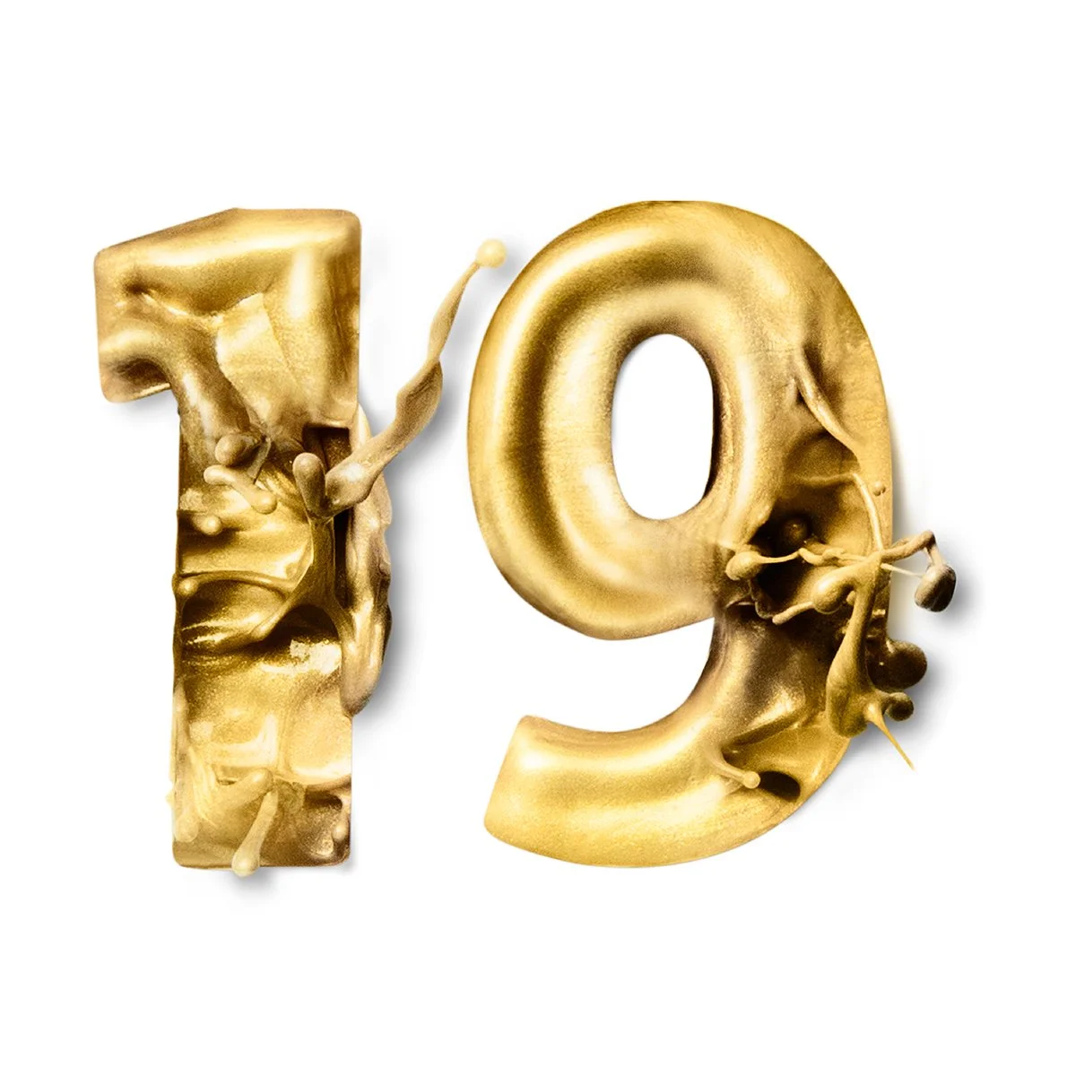
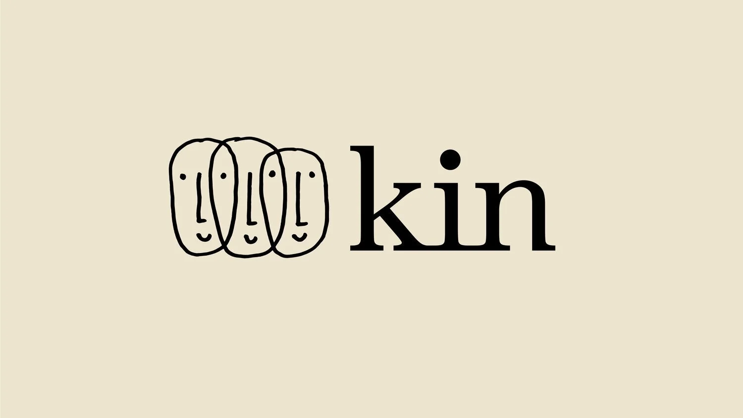
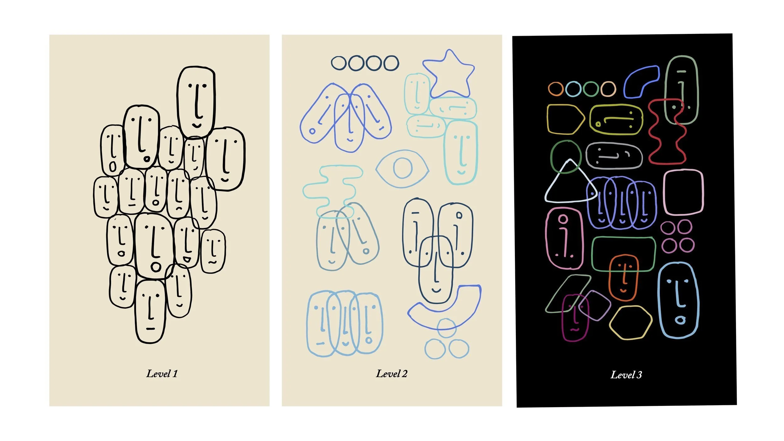
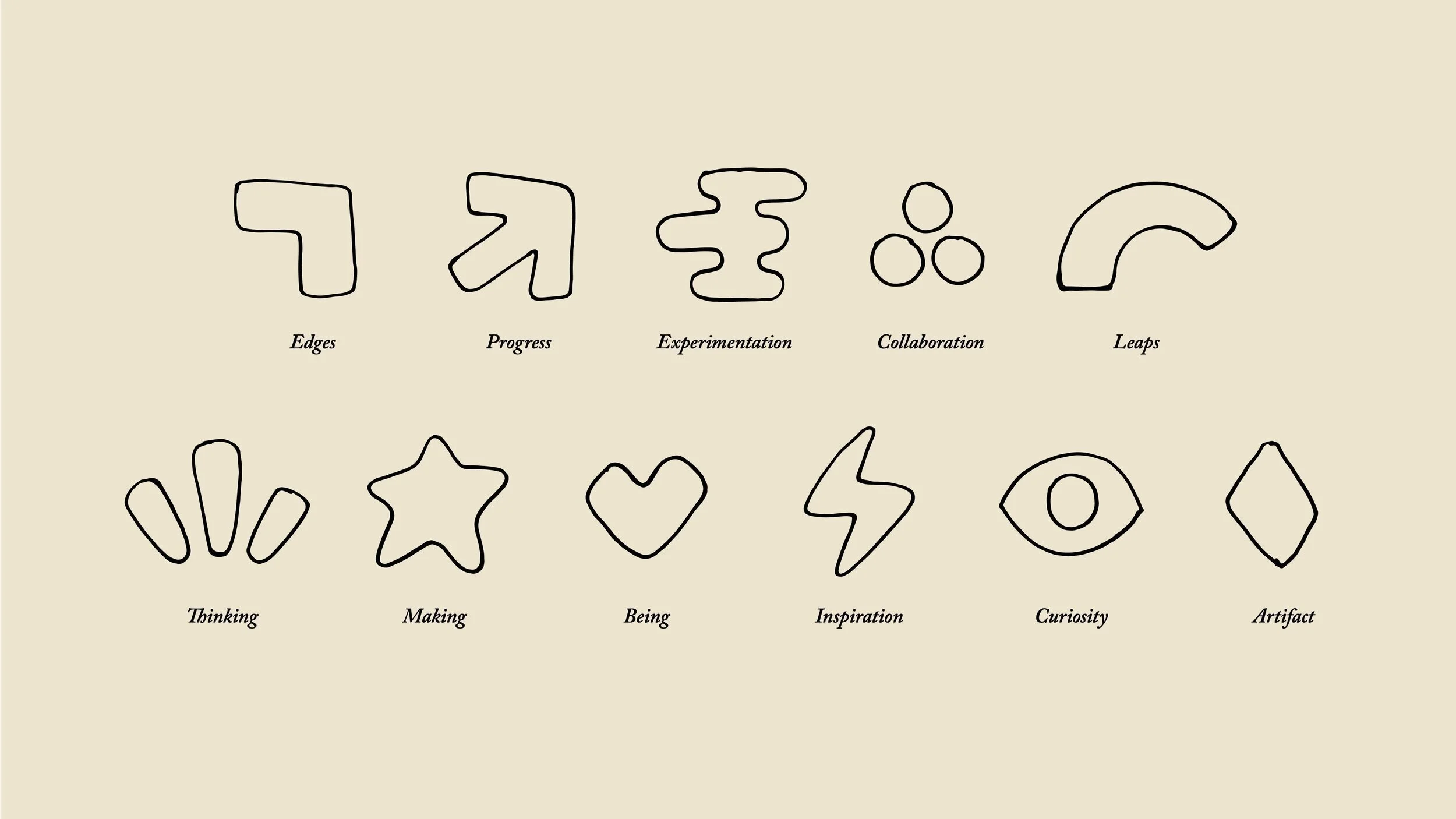
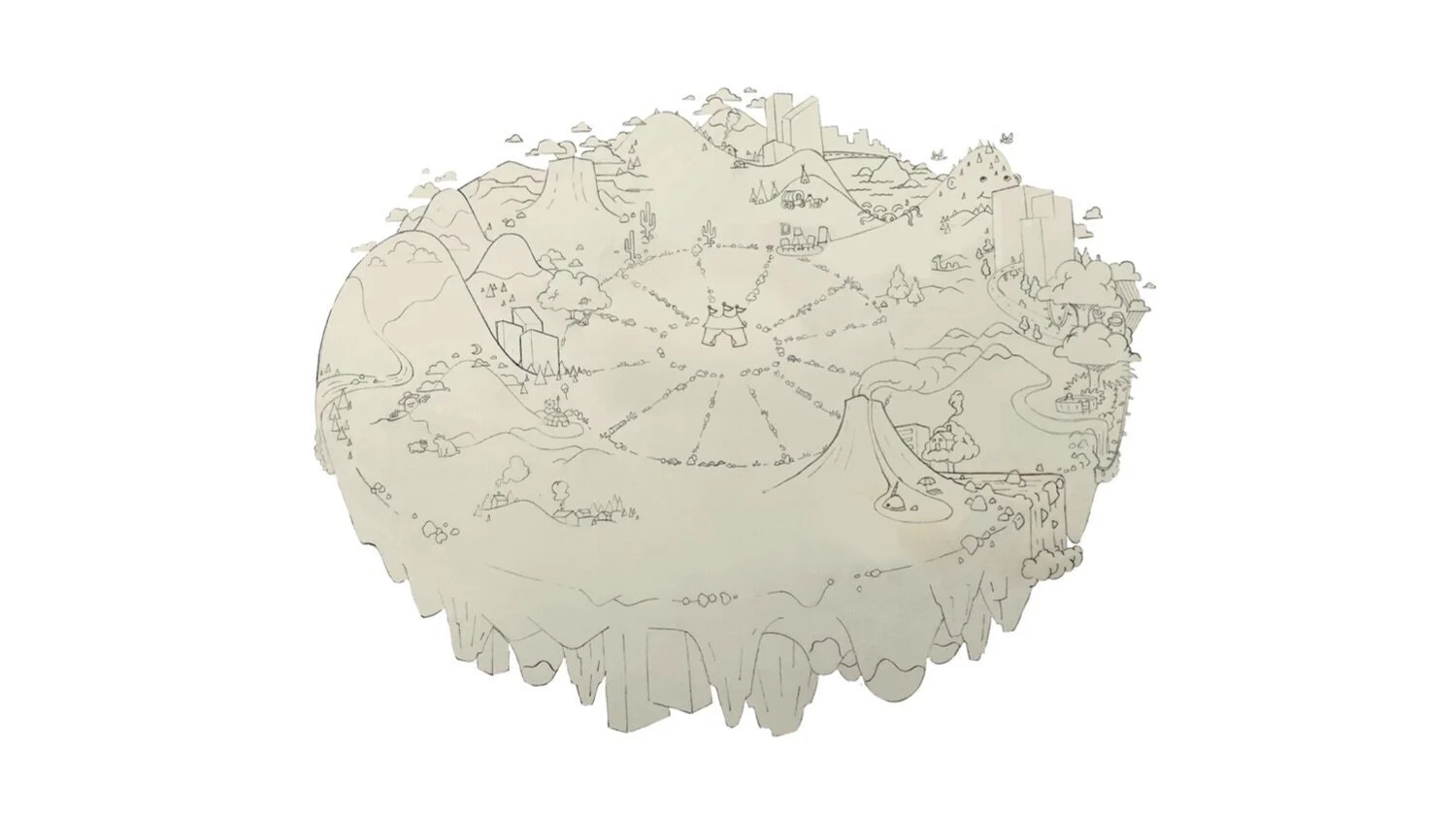
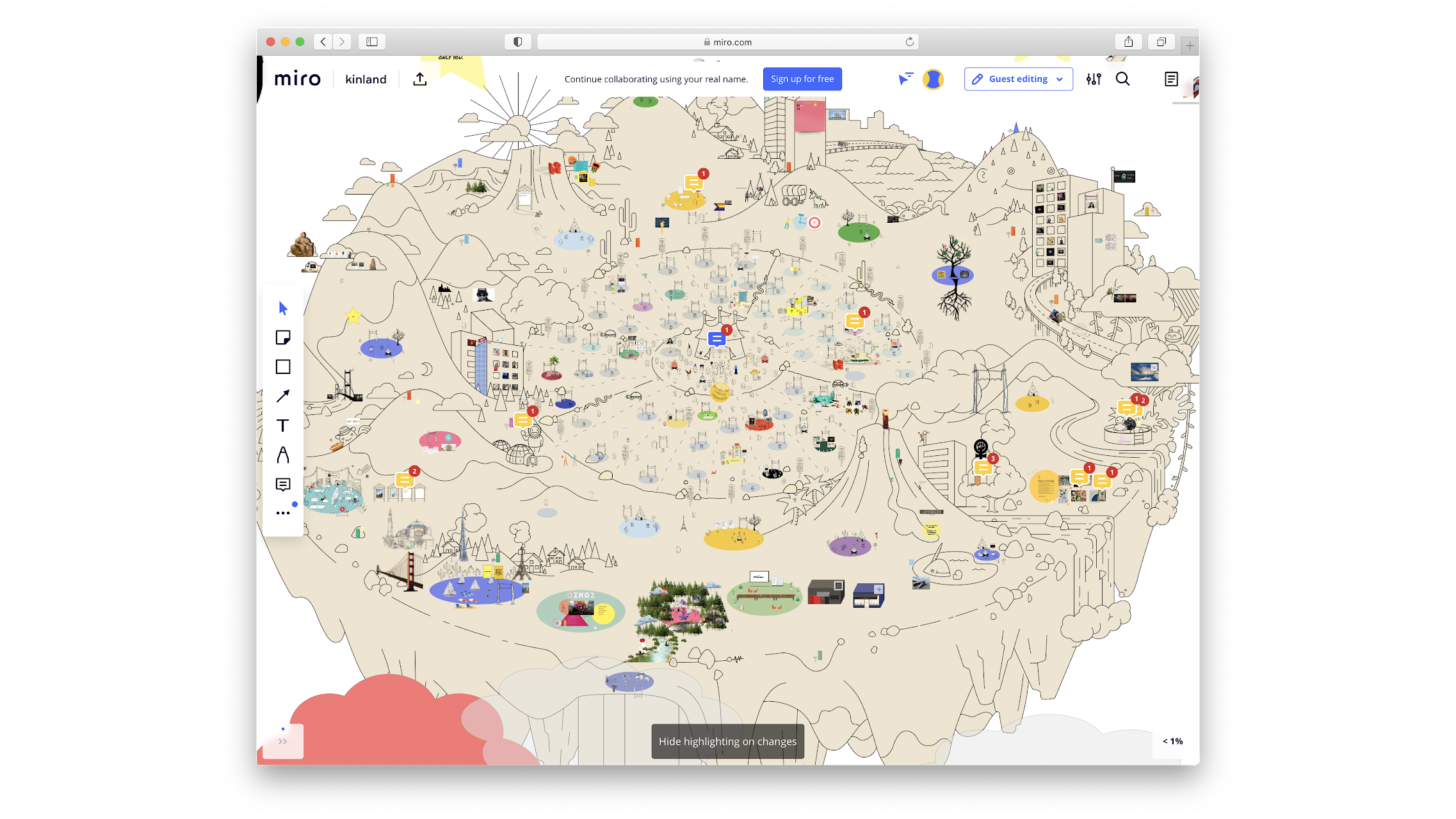
Kin
What:
The artfully accessible and endlessly adaptable identity is built on a name that celebrates the collective’s fundamental belief in shared purpose. The hand-drawn logo connects individual and community, and extends to thematic wayfinding. An accompanying virtual world was co-created during the event as a means of connecting 2500 thinkers and makers around the globe.
Why:
As kyu expanded its best-in-class portfolio of creative firms, it wanted to create a collective-wide, multi-day event designed to represent the thinking and making that leads kyu businesses to propel society and economy forward.
Who:
kyu / Sid Lee, Creative Director
Event Naming, Visual Identity & Digital Experience / 2021
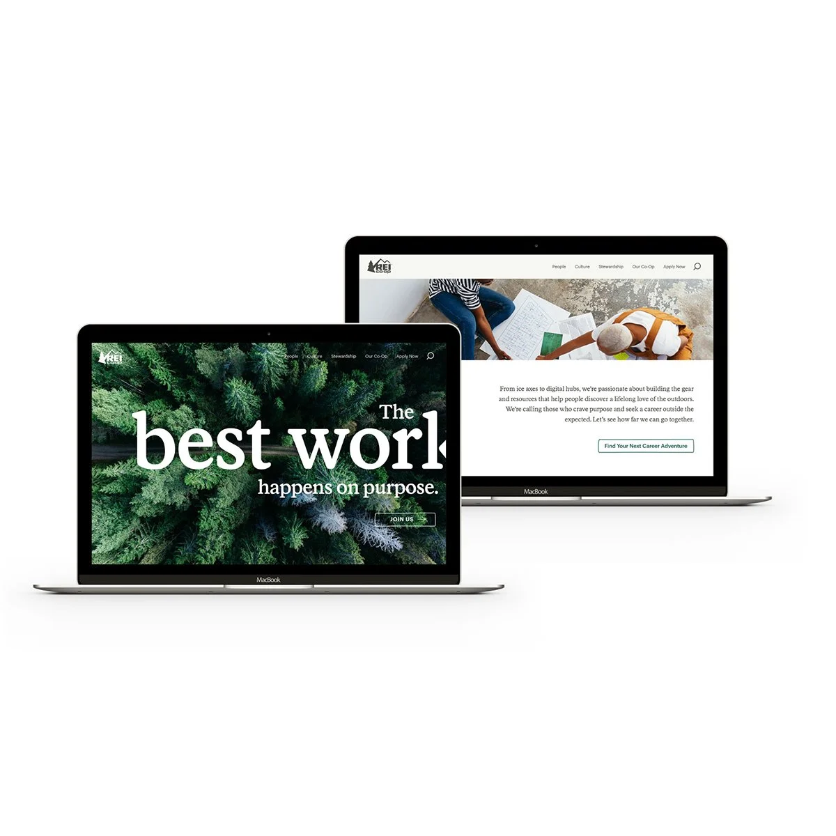
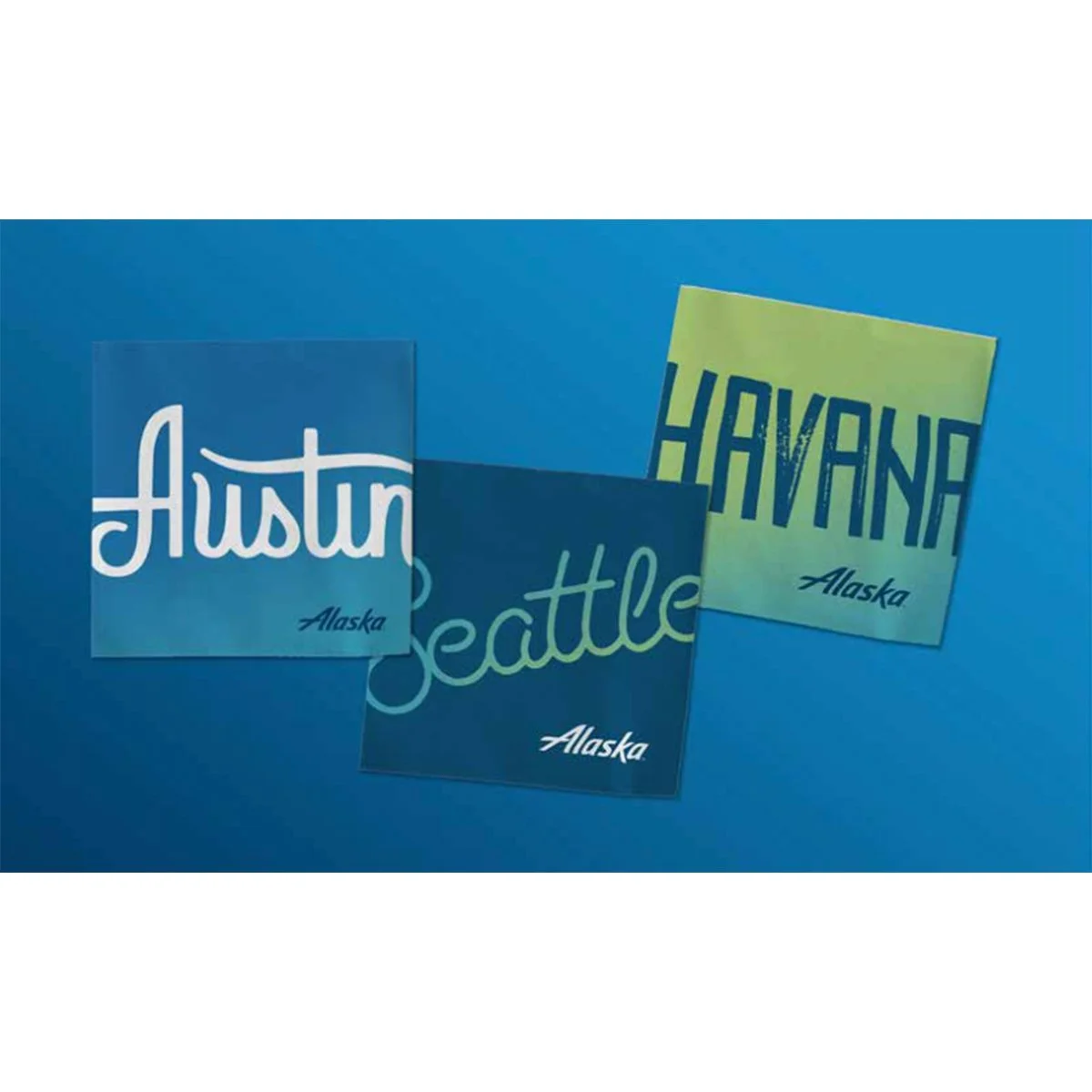
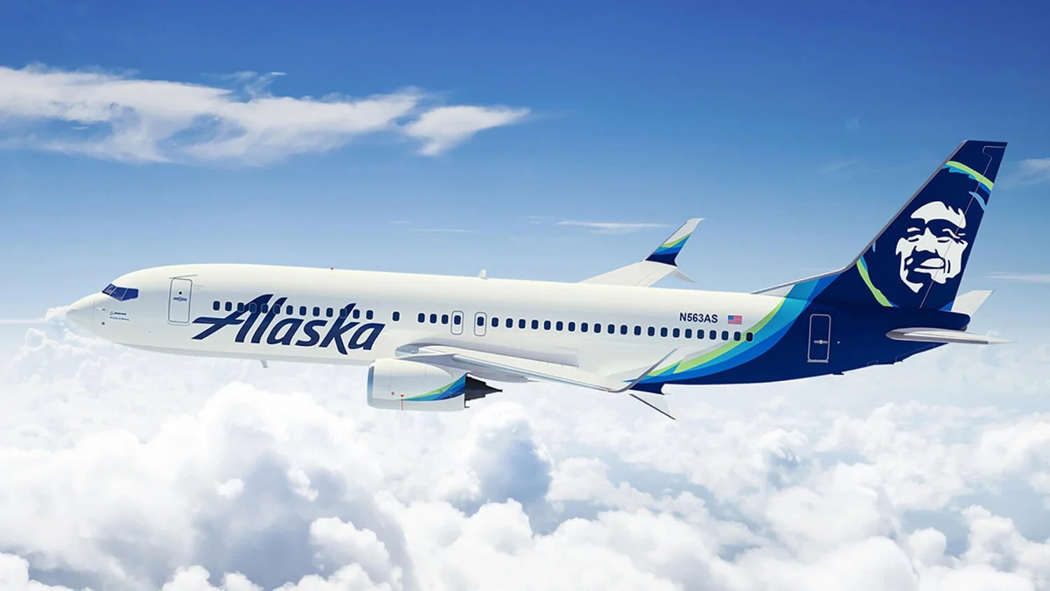
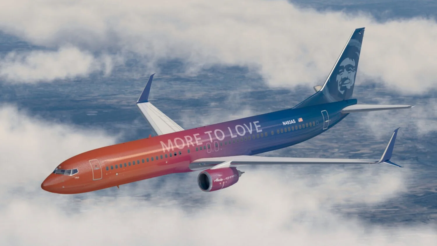
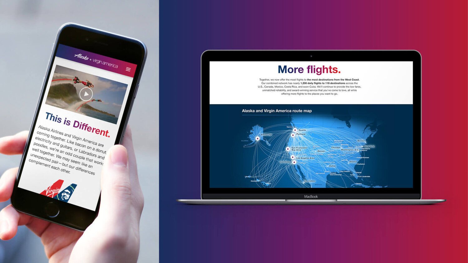
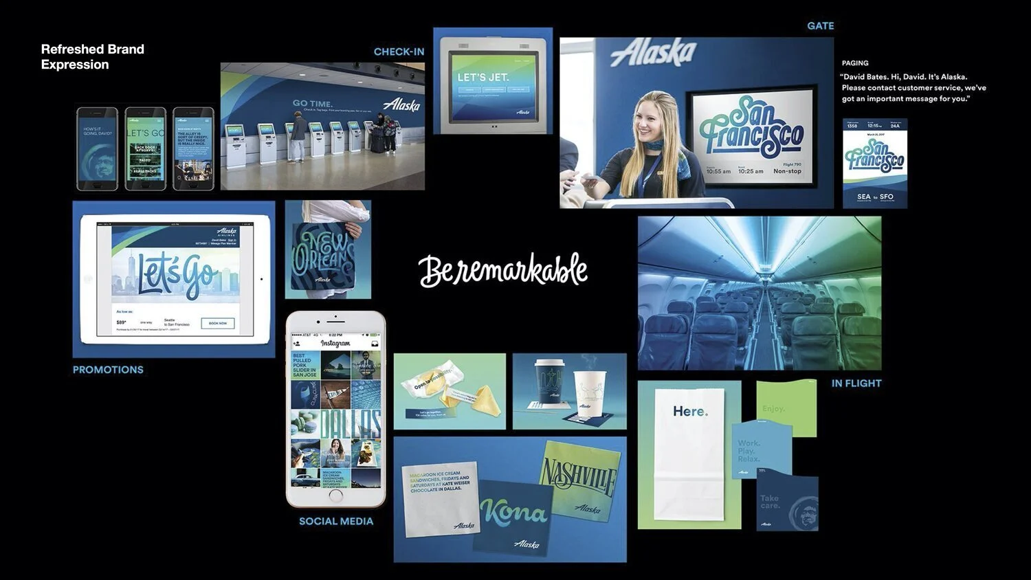
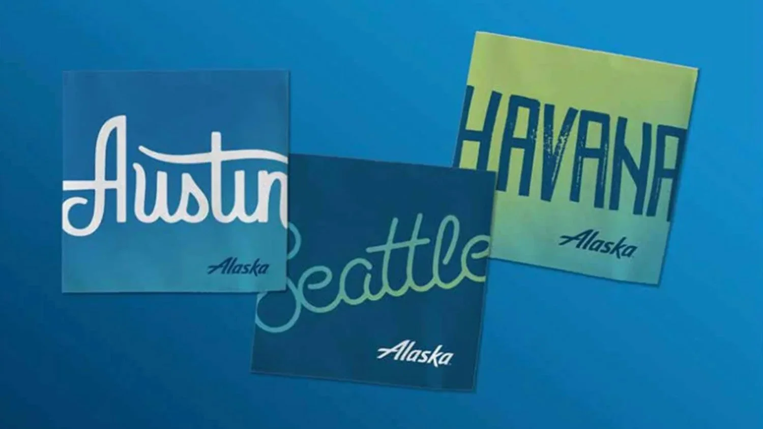
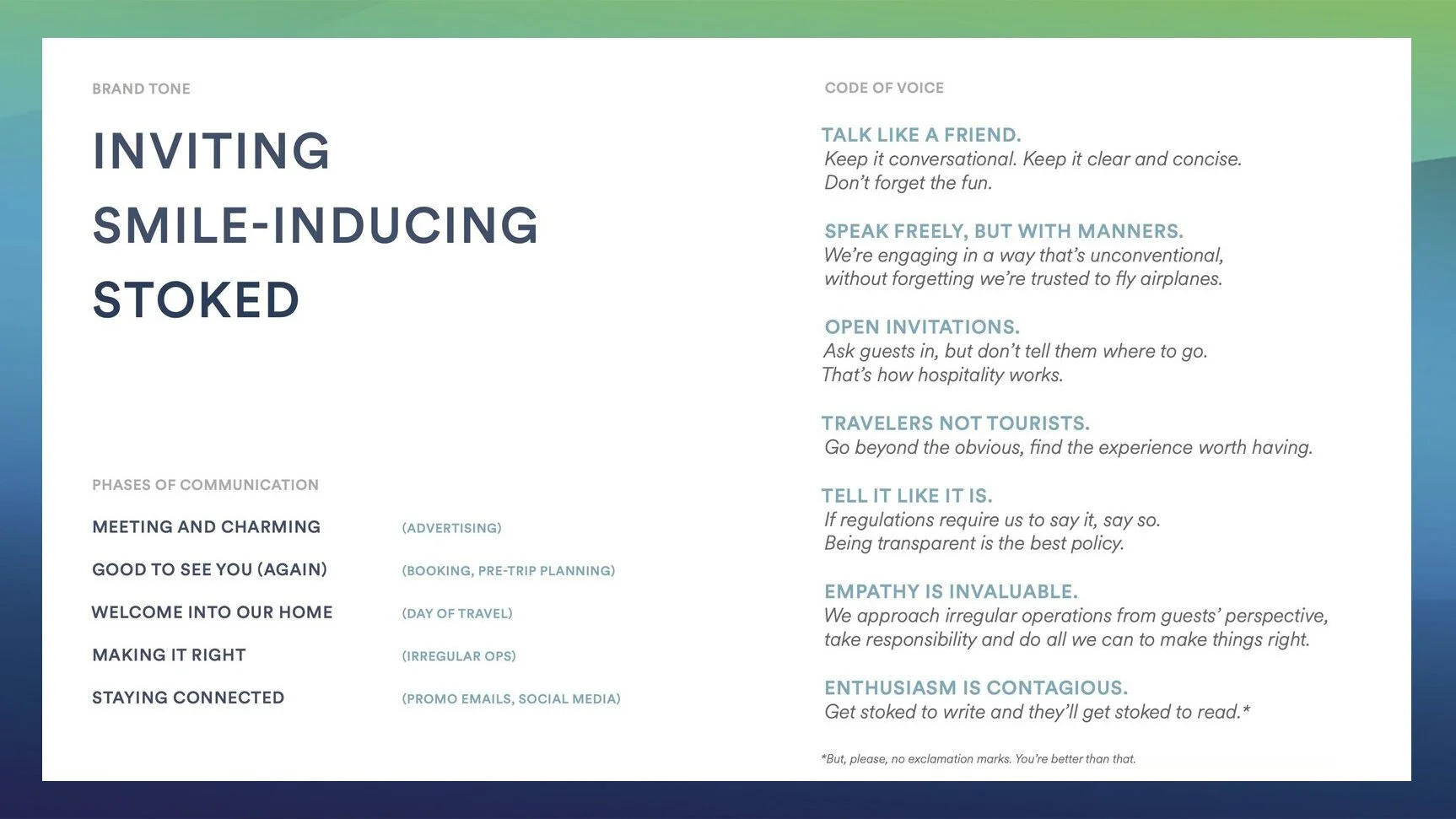
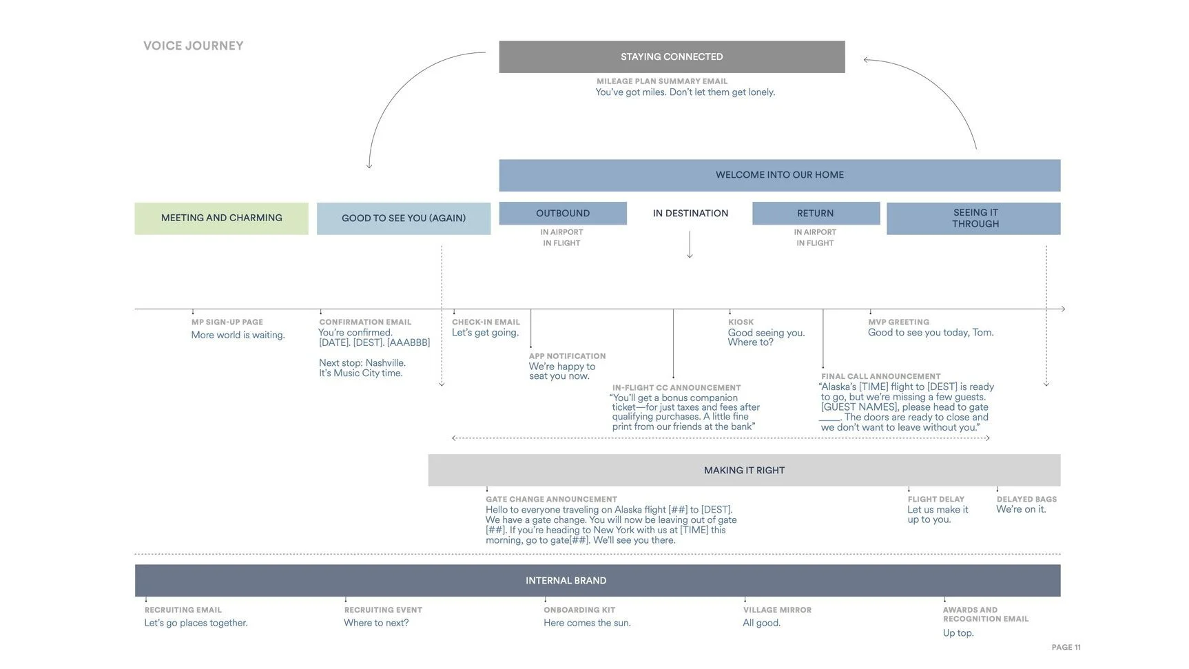
Alaska Airlines
Why:
For more than 80 years, Alaska Airlines has built a loyal following in the Pacific Northwest by combining award-winning performance and caring customer service. But in today’s world of relentless industry competition and price-driven decision making, Alaska needed to extend brand awareness, increase relevance and give fliers more reasons to choose Alaska. Merging with Virgin America made Alaska the fifth-largest domestic carrier, while also presenting challenges in loyalty, operational confusion, and how to most successfully deepen and extend reputation.
What:
Charged with the visionary goal of “not losing one flier,” Alaska needed to bring together the best of both airlines. Defining a strategic position of “most west coast,” the refreshed brand identity reflects thoughtful, vibrant and unconventional touchpoints across the full flier journey, from livery designs to onboard experiences, communication strategies to each message along the way.
Who:
Hornall Anderson, Creative Director
Brand Design & Expression / 2016-2018
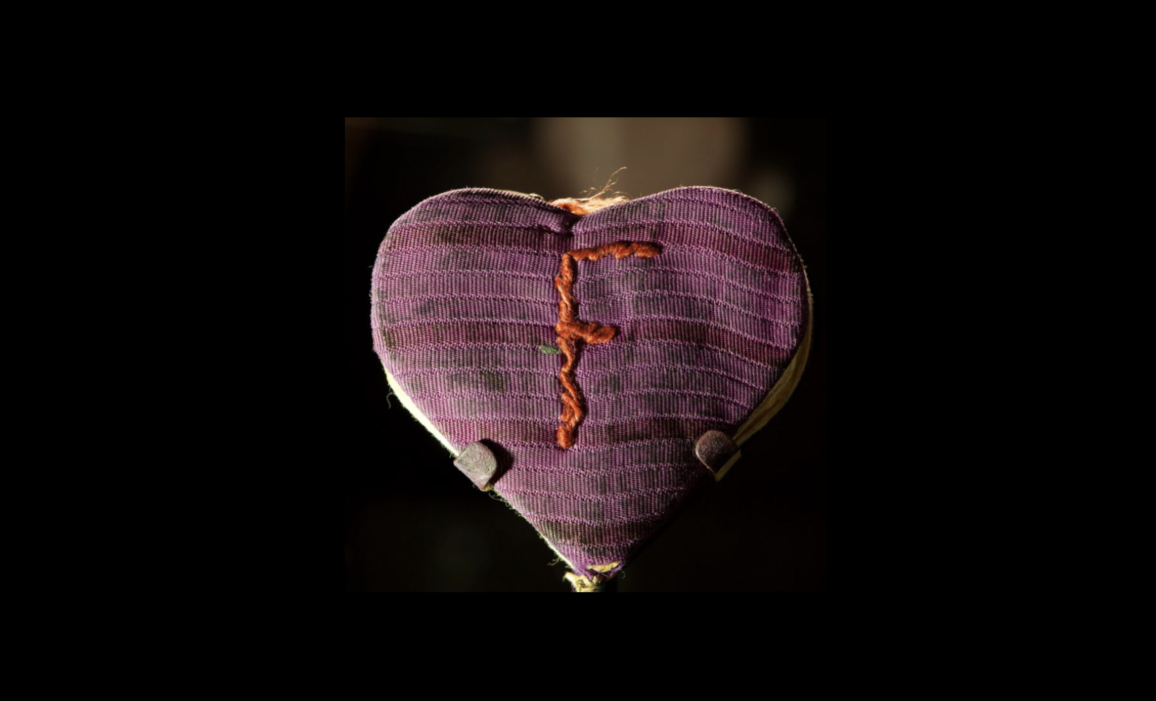
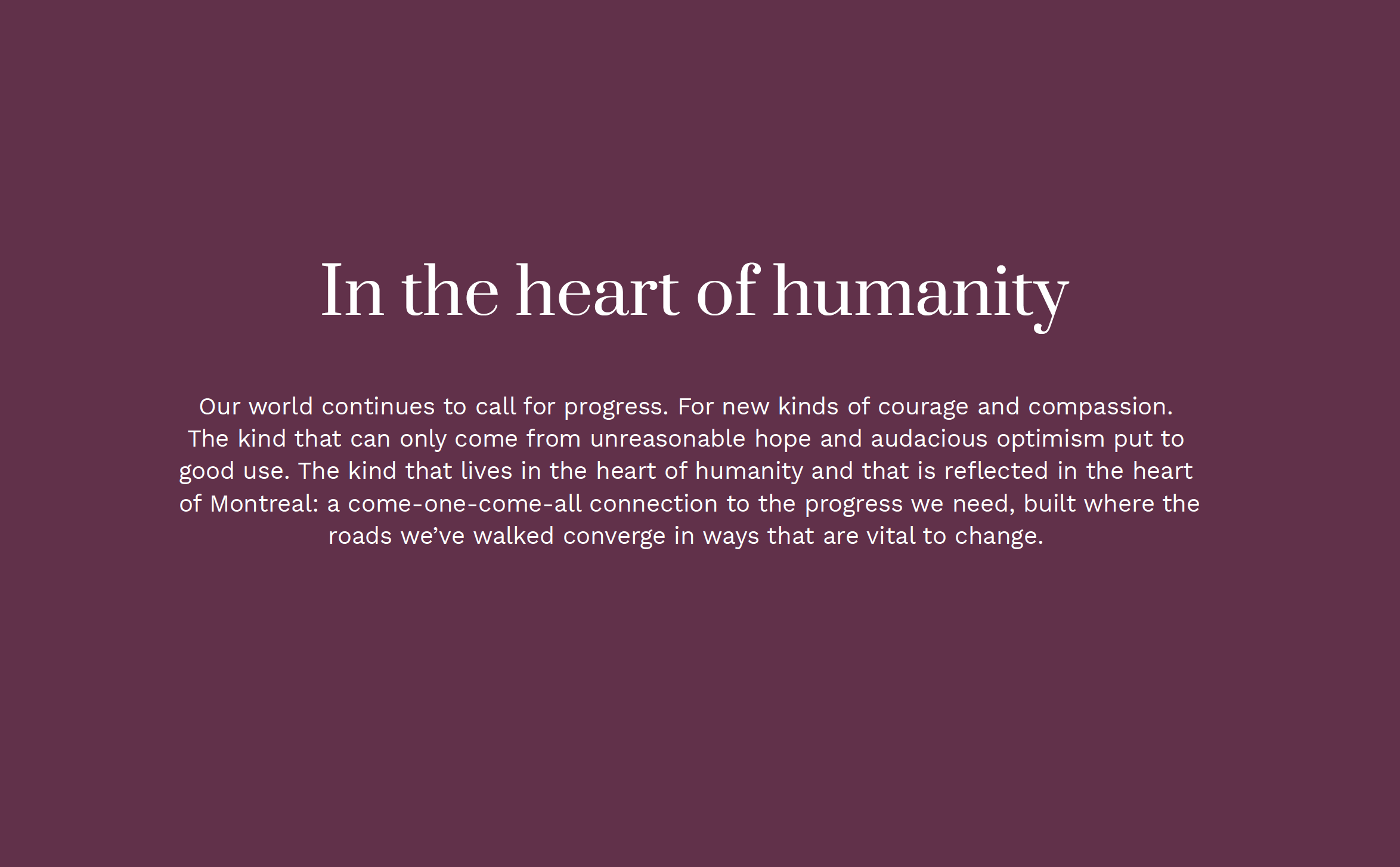
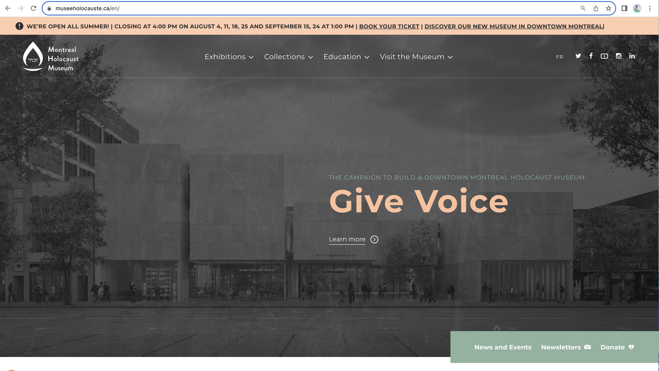
Montreal Holocaust Museum
Why:
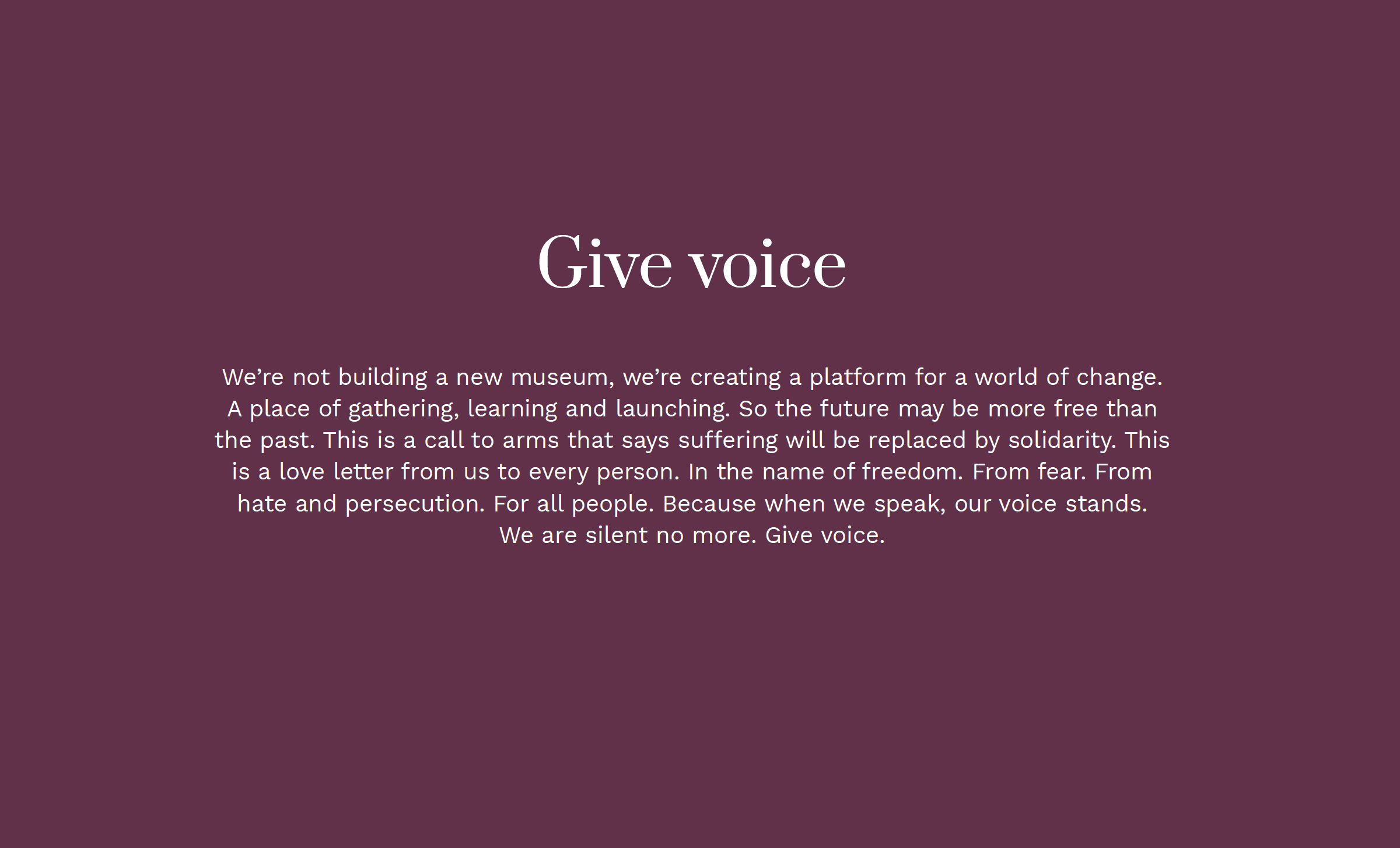
In 2025, the Montreal Holocaust Museum will open its doors at a new location in the heart of the city’s cultural sector, along Saint-Laurent Boulevard. With innovative programming and expanded presence, the new museum will help galvanize communities throughout Quebec and Canada as they stand up for a society free from hate and persecution. As of summer 2023, the Campaign confirmed over $88M of its $90M goal raised.
What:
Drawing a parallel between the museum’s new location and its most sacred artifact, the campaign introduced the overarching idea of The Heart of Humanity. Just as the Heart of Auschwitz symbolizes the power of human devotion, the museum represents a touchstone for vital action. The quiet campaign’s first message has been to strategically reframe giving from that of dollars to that of voice. In doing so, it breaks through the often-paralyzing silence, creates a platform for progress, and elevates monetary value to human impact.
Who:
Sid Lee, Creative Director / Writer
Brand Design & Expression / 2021
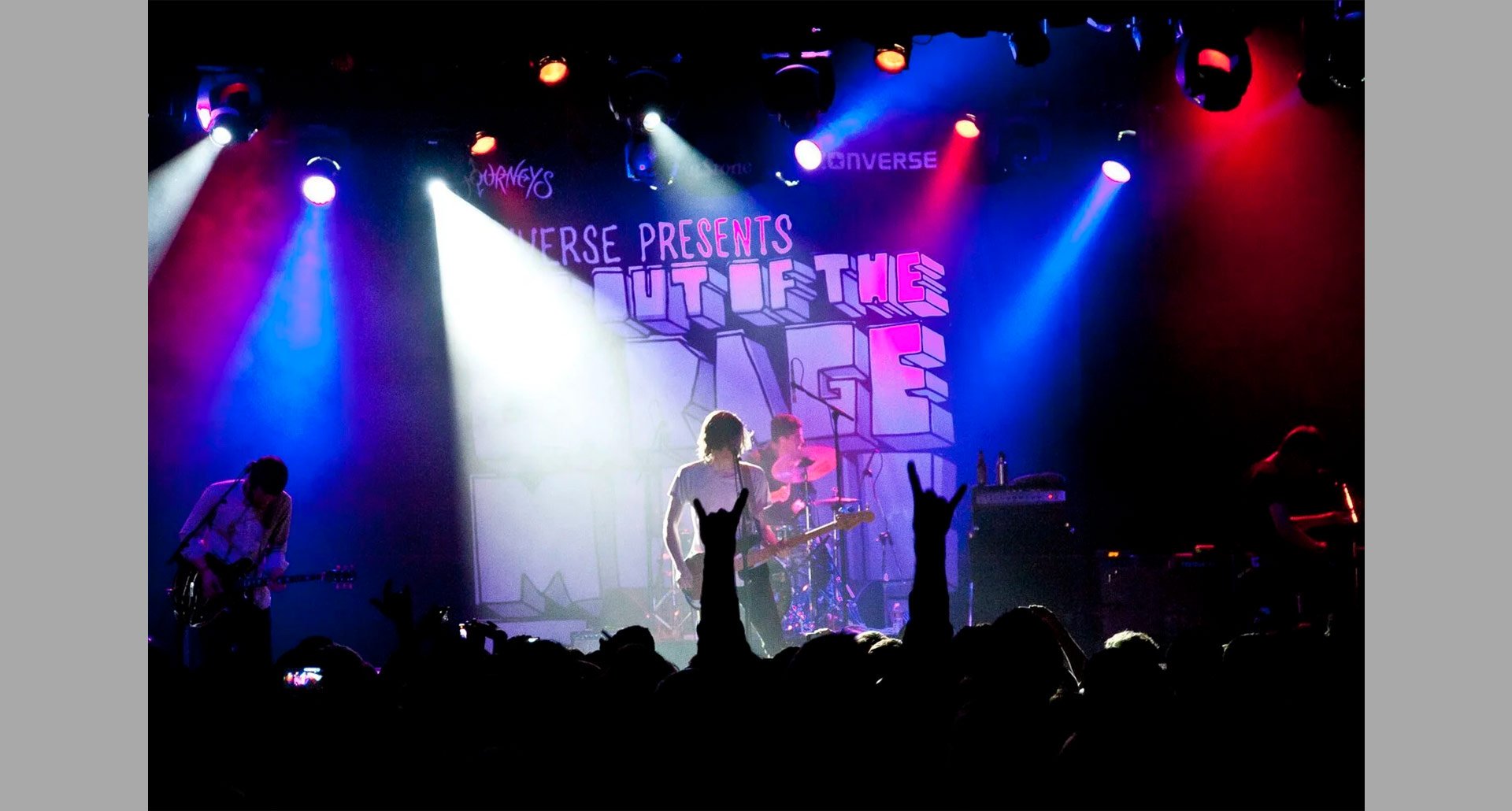
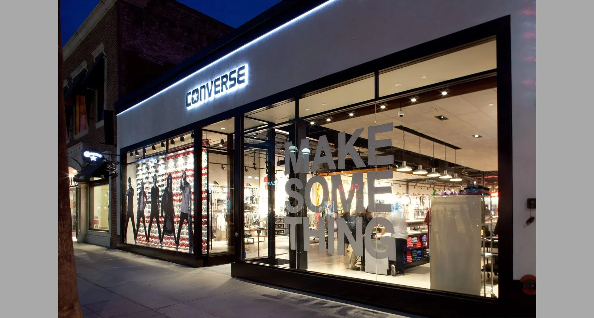
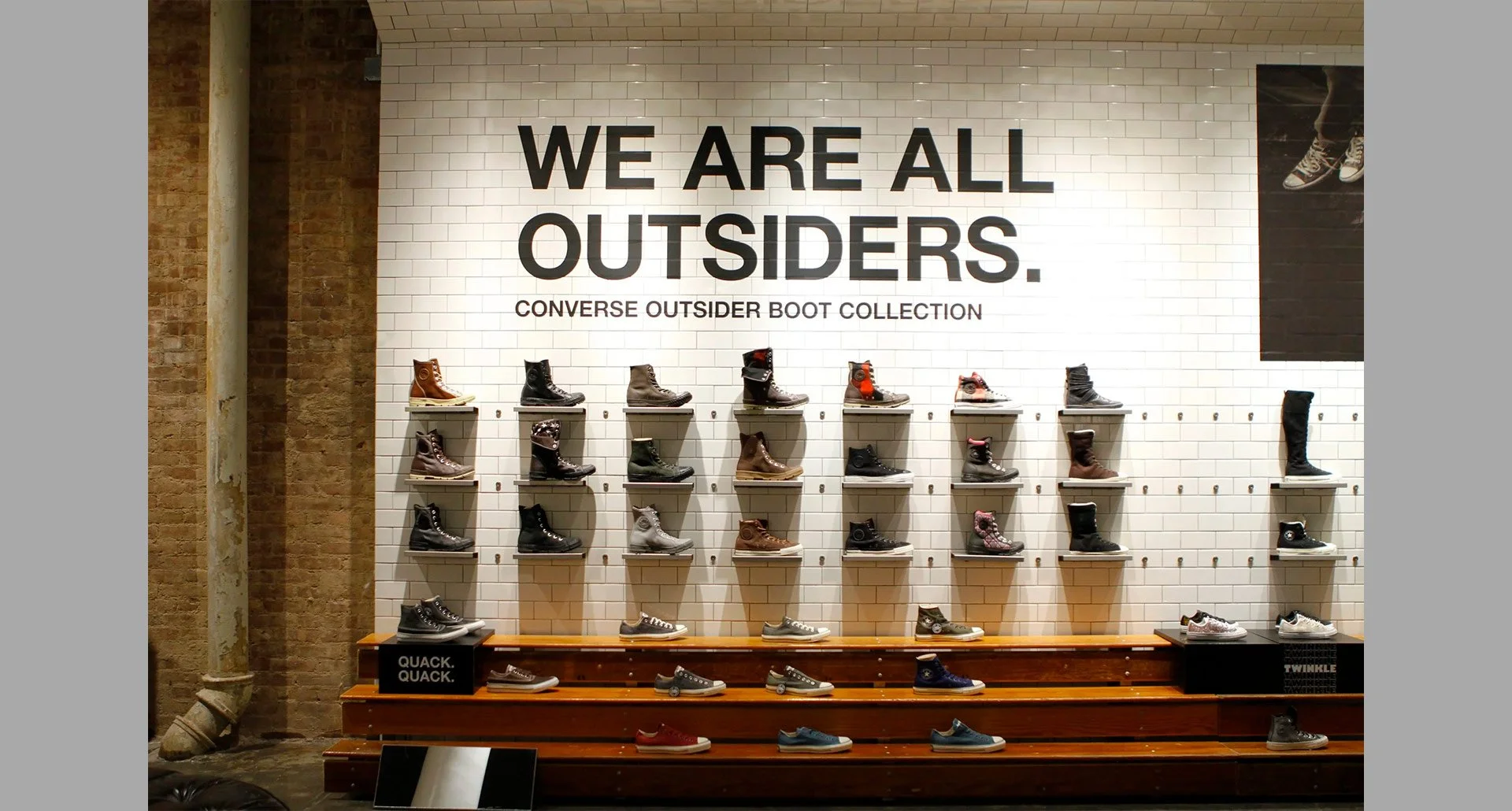
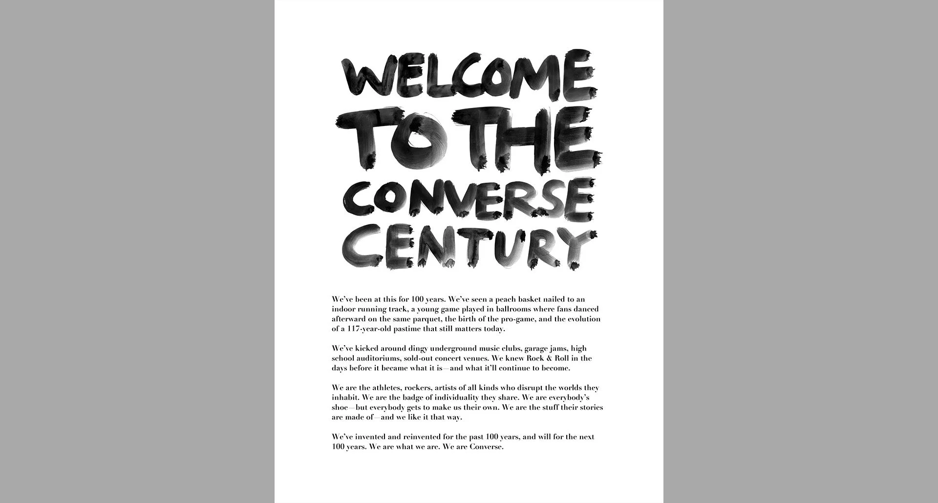
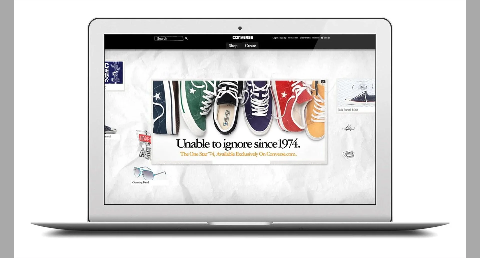
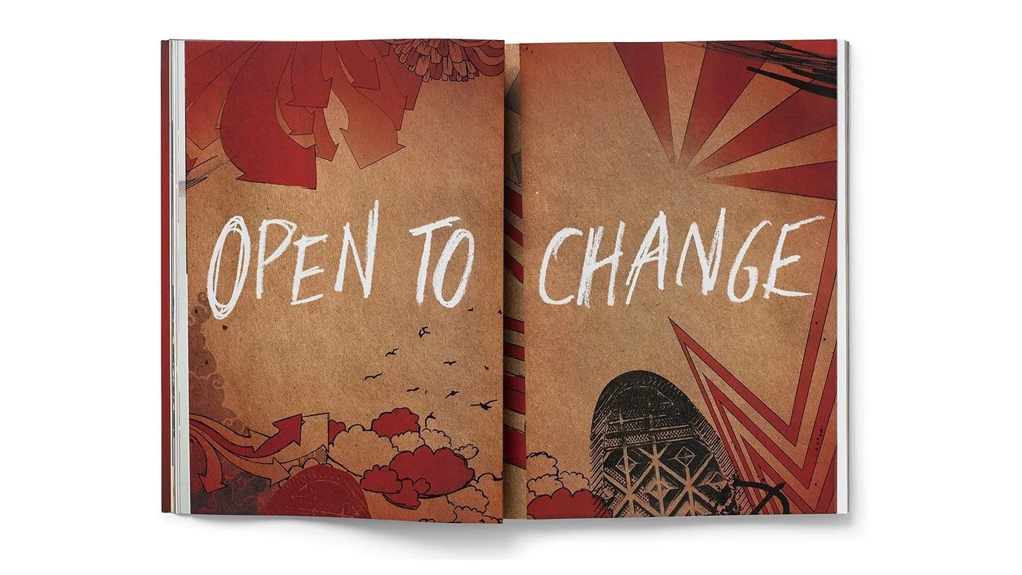
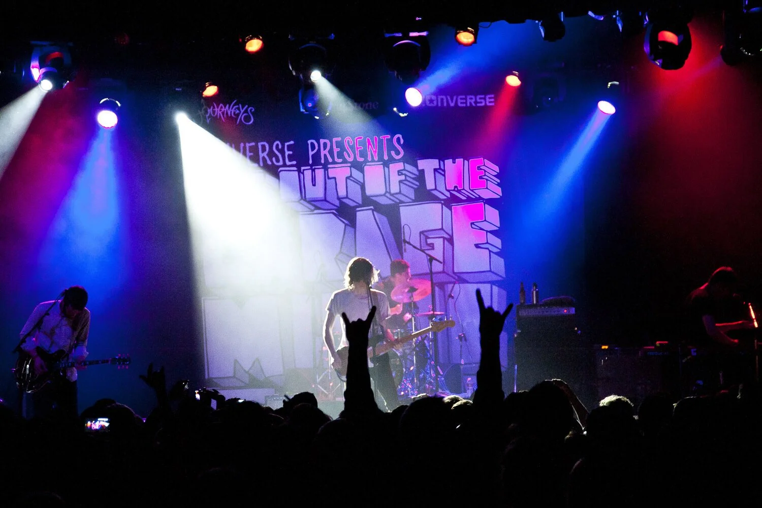
Converse
What:
Converse Brand Design transformed the master brand and its portfolio of brands across all altitudes and channels by harnessing the power of creative community, creating an open invitation for participation, and innovatively fueling the belief that creativity can change the world. In doing so, it helped slingshot the business from $800M to $3B.
Why:
Following Nike’s 2003 acquisition, Converse faced a rare and complex challenge: how to transform one of the world’s most iconic and beloved brands from a shipping organization into a self-propelled industry leader and culture creator.
Who:
Converse Brand Design, Writer
Brand Design, Brand Voice & Narrative / 2005-2012
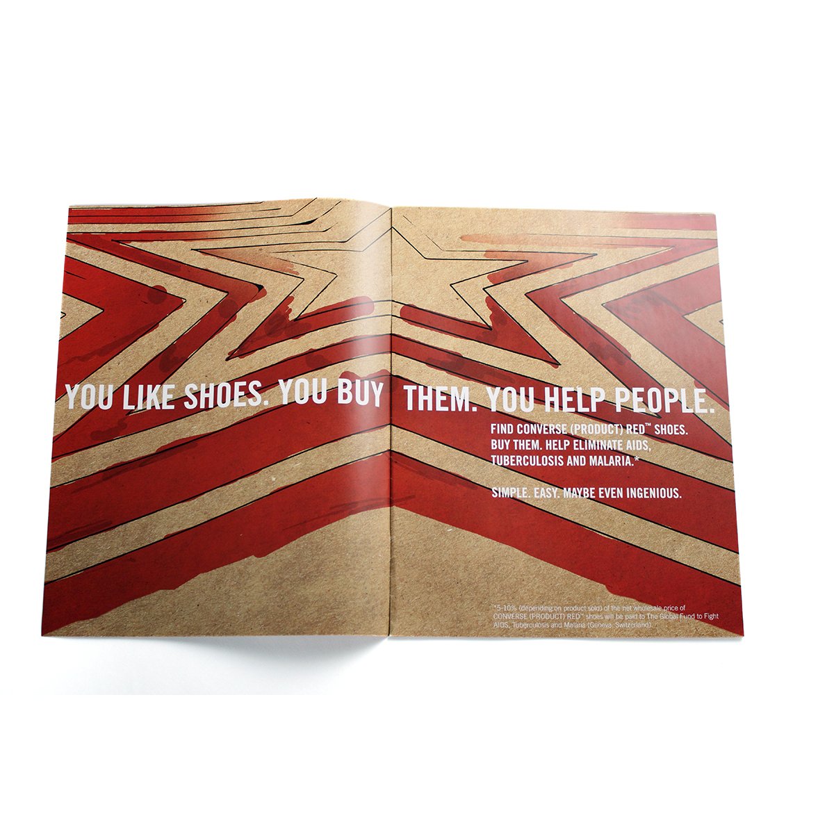
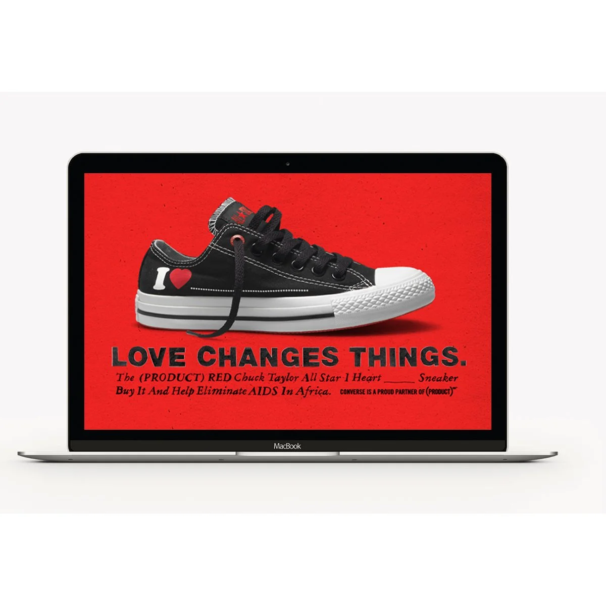
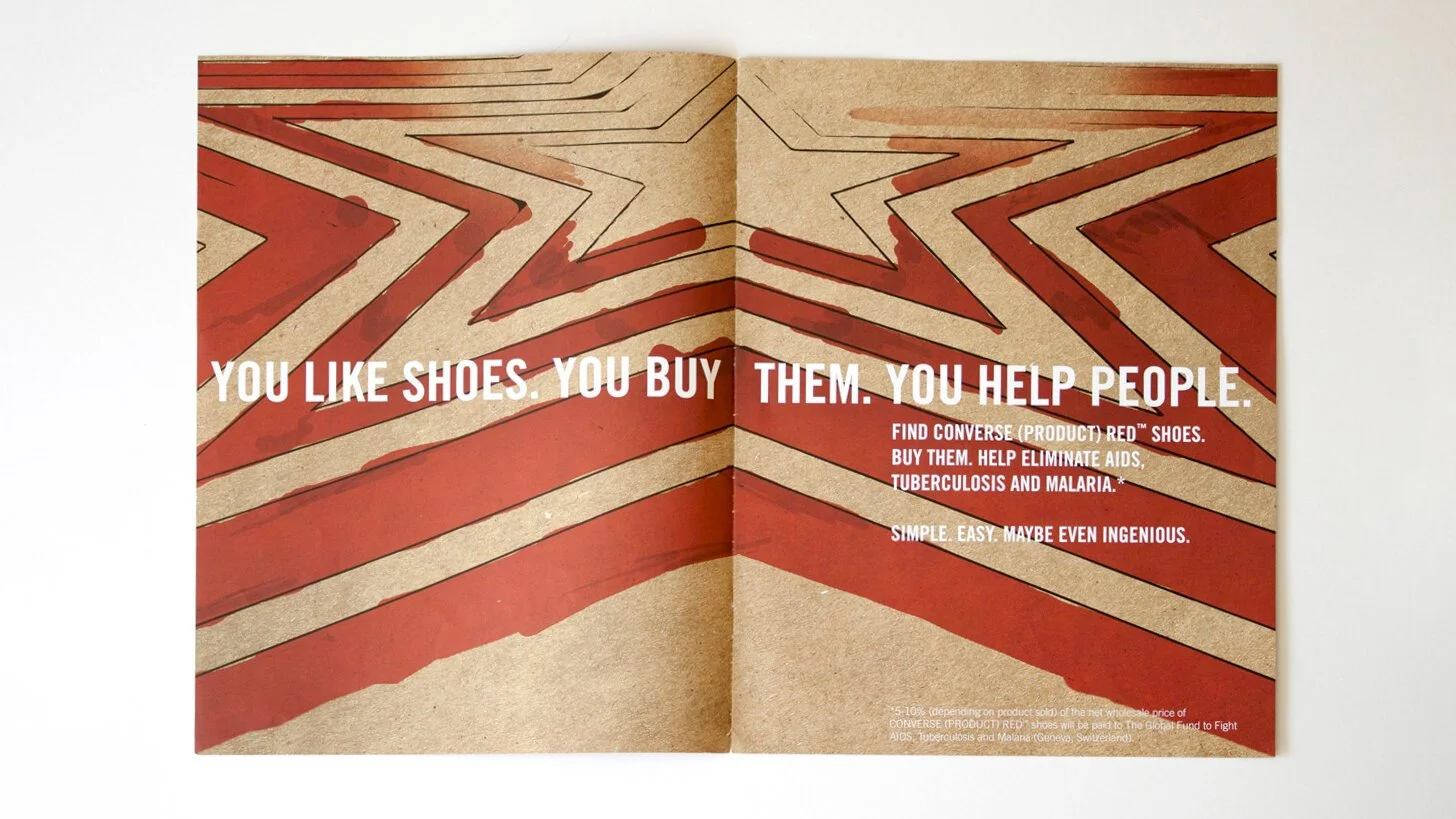
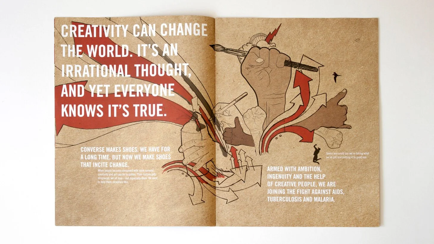
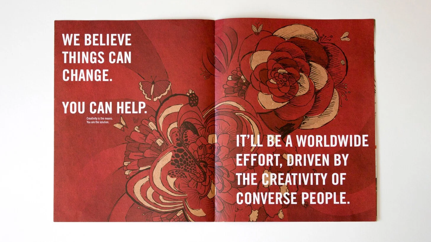
Converse (RED)
Why:
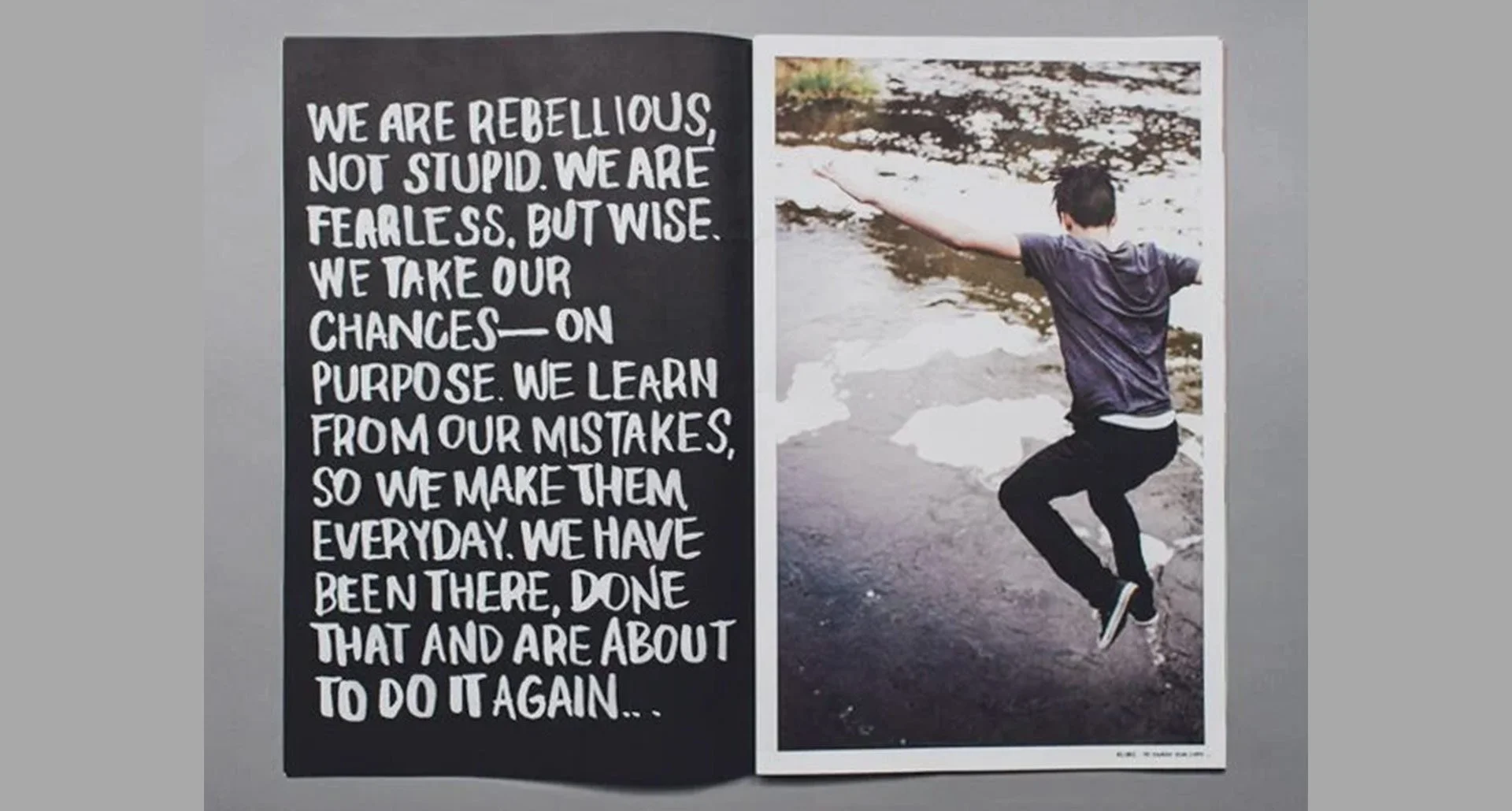
The early 2000s marked the beginning of a new era in consumer marketing, one that pulled down the walls between products and purpose. Conscious consumerism was a big idea and a massive opportunity. It also revealed itself as complicated and challenging for consumers to understand. As a brand built on deep personal values, Converse was an easy choice for participation–but it struggled to articulate the proposition in ways people could understand.
What:
The brief for foundational positioning of Converse (RED) was clear: make people understand, make them care, drive purchase. In other words: how far can we distill this massive idea? The solution was to leverage the clarity and human-centered focus of Converse’s voice to create a natural door in, and then build opportunity and impact from there.
Who:
Converse Brand Design, Writer
Brand Design, Brand Voice & Narrative / 2008
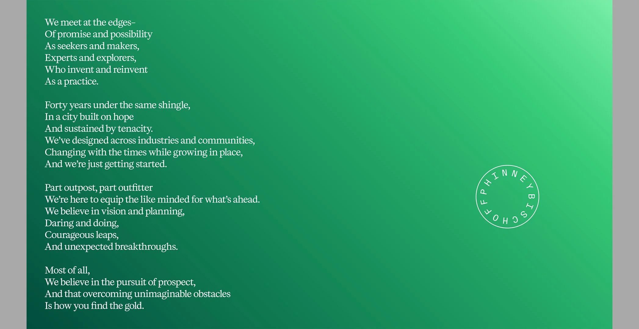
Phinney Bischoff
What:
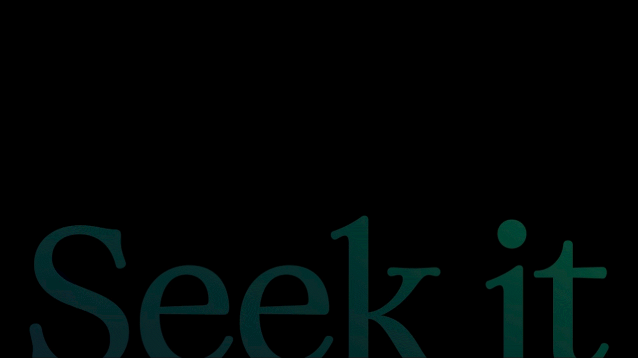
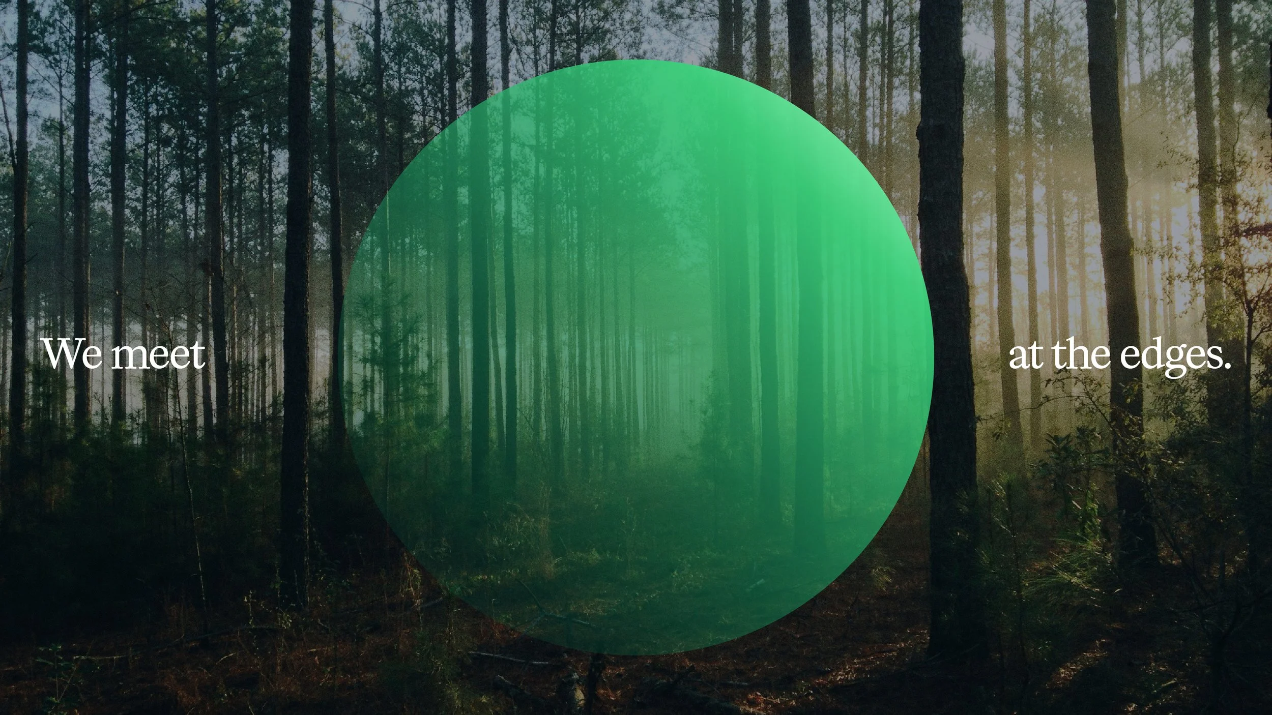
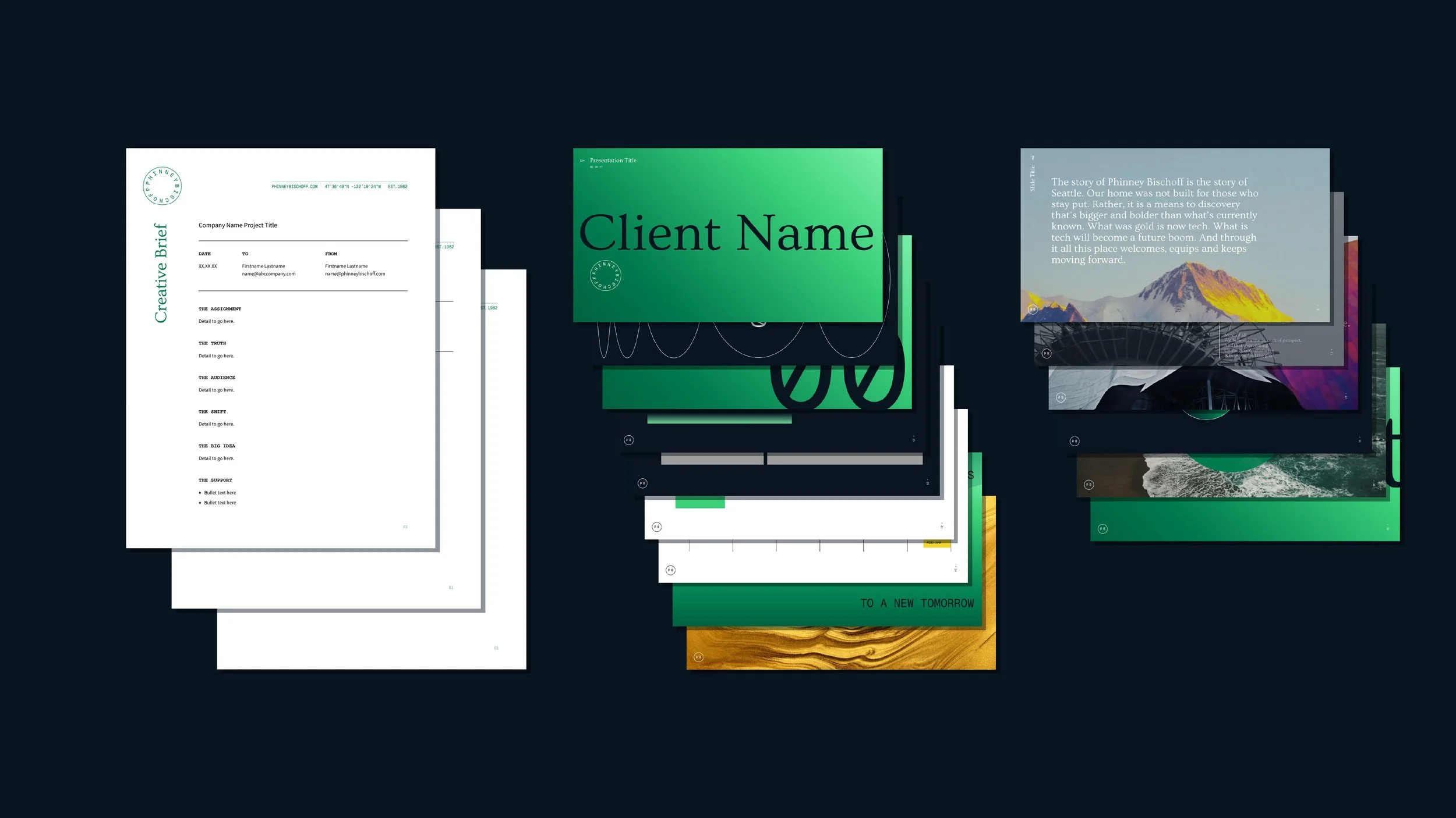
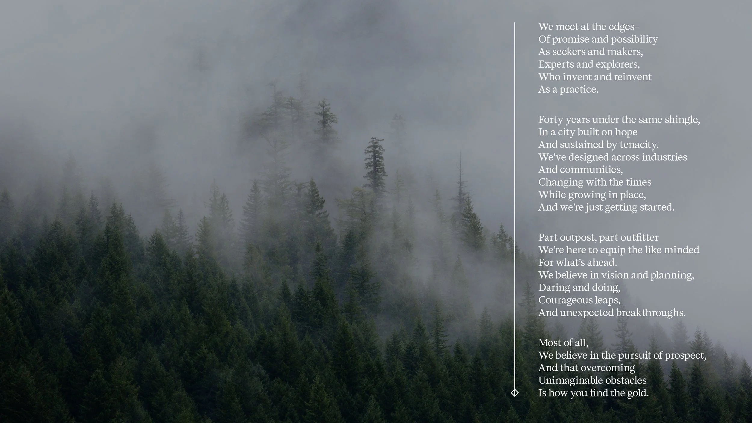
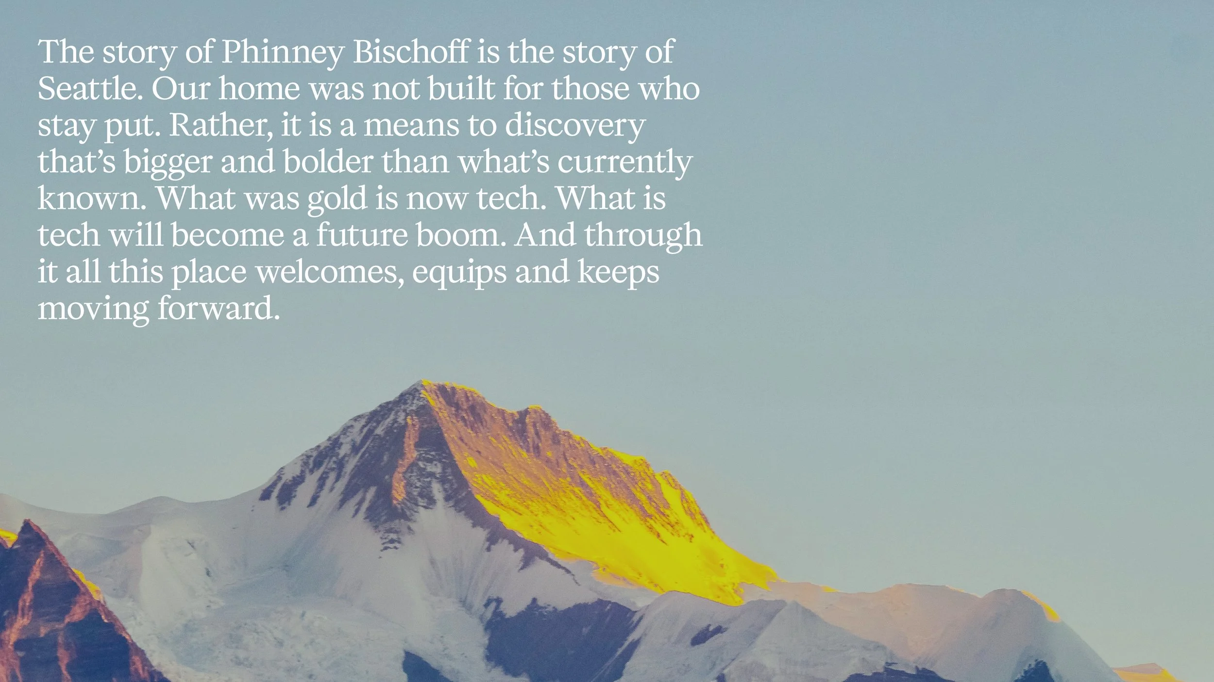
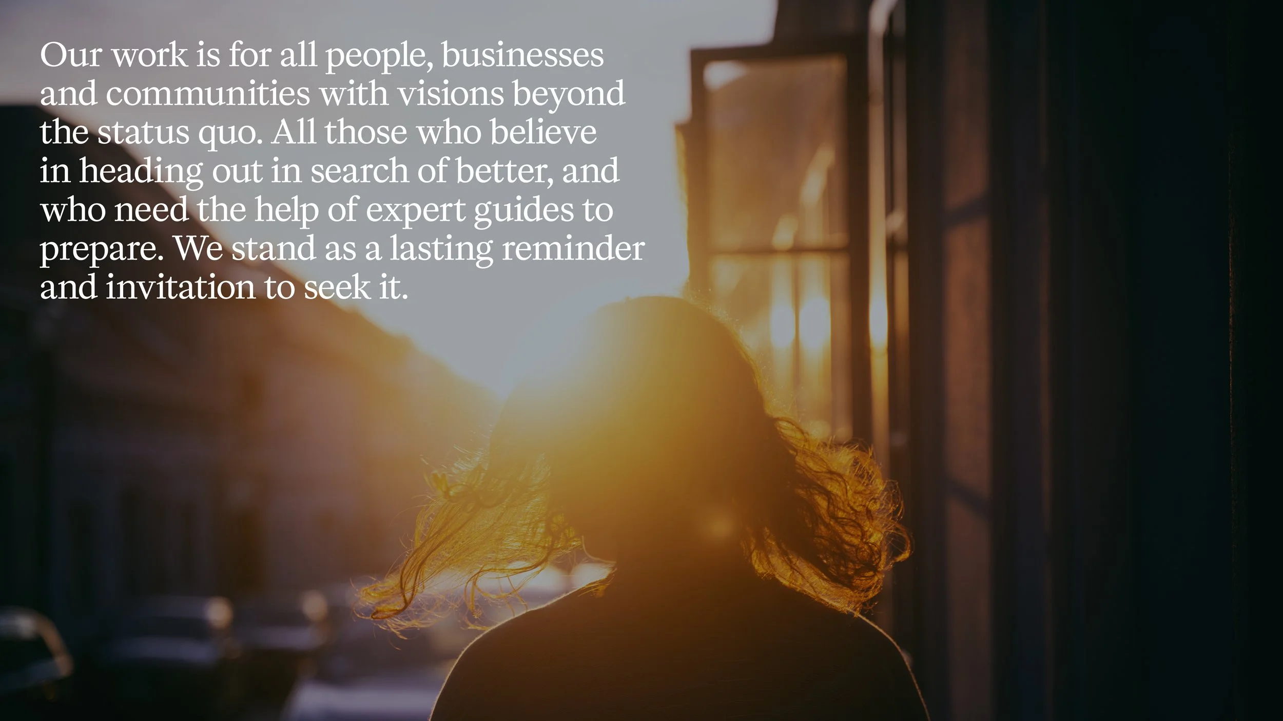
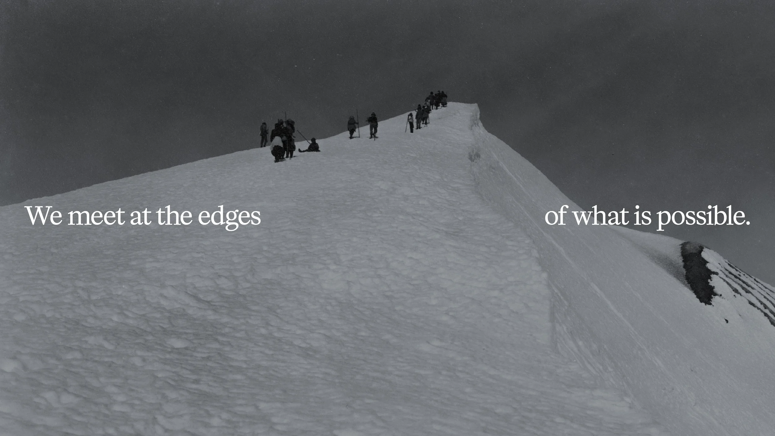
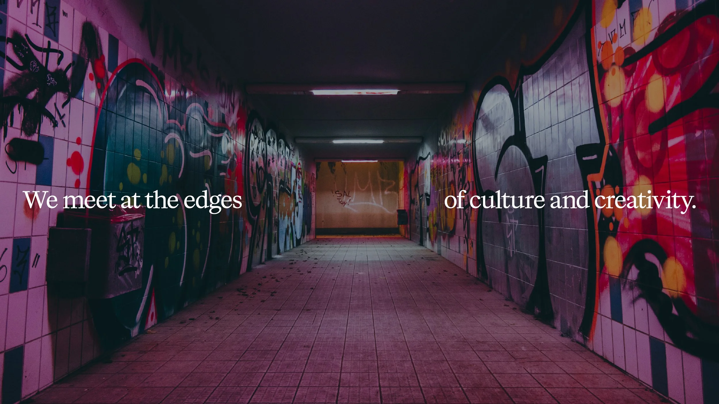
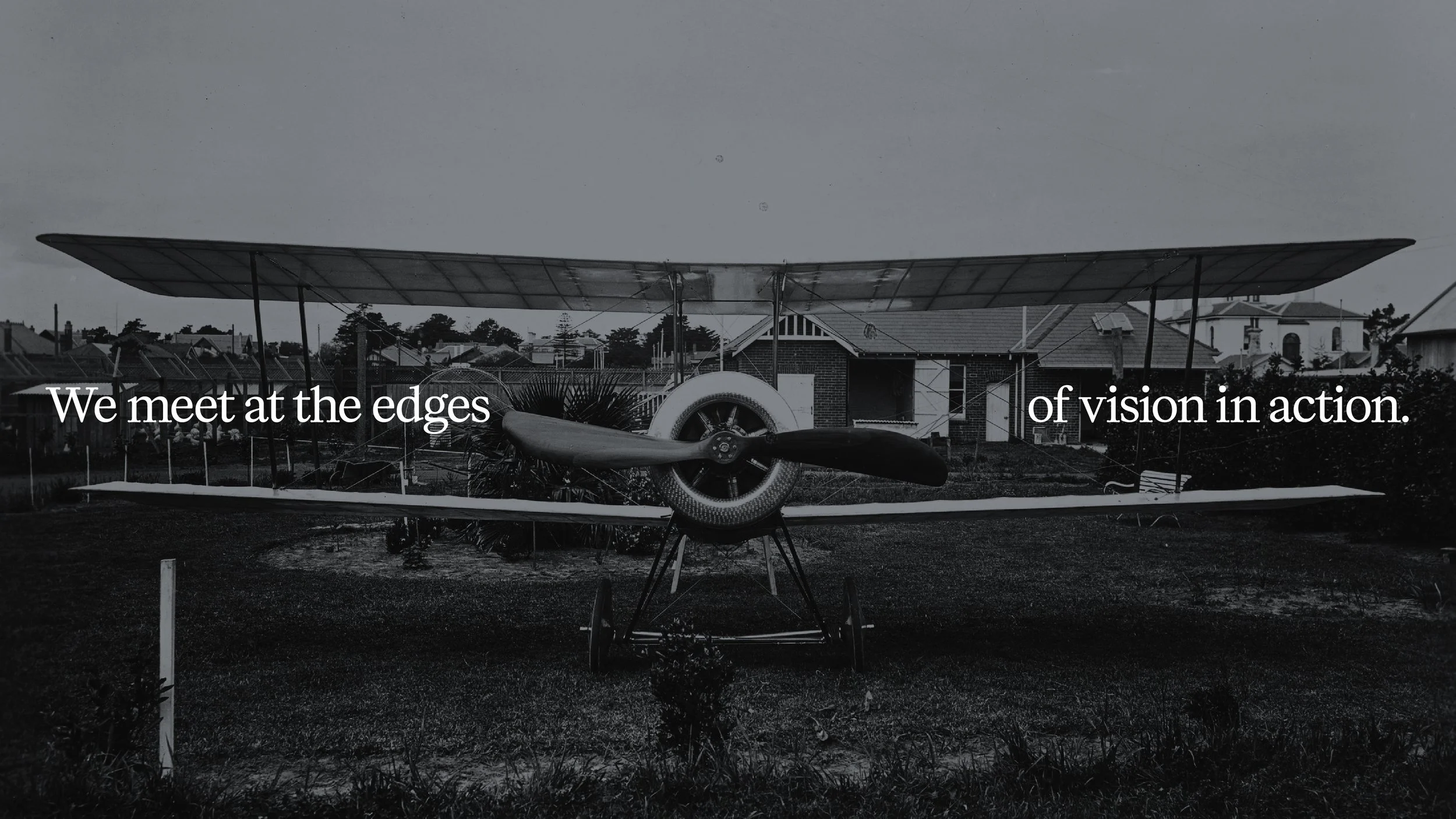
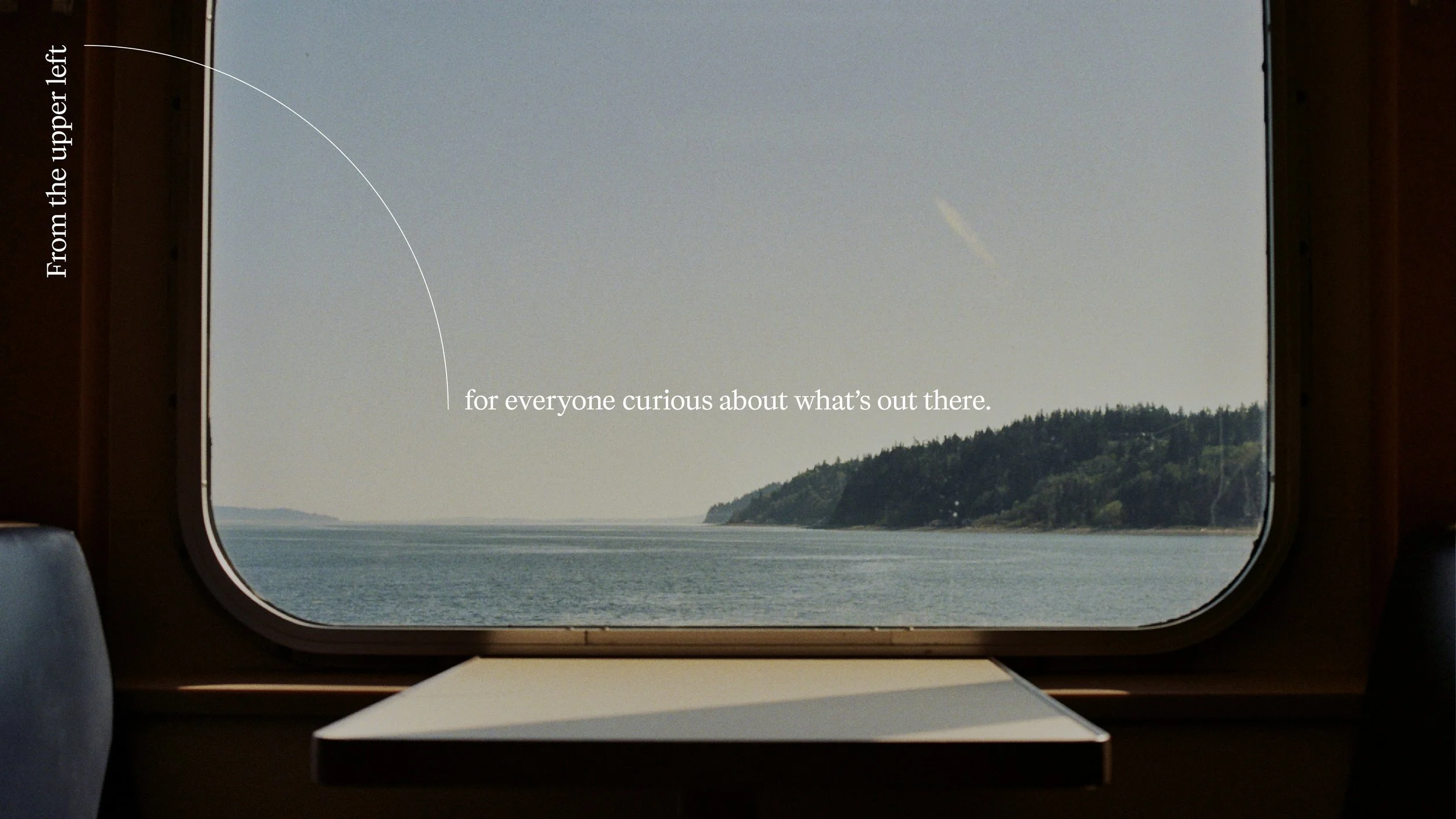
A full agency rebrand focused on leaning into the truths of our time, into how business and people respond, as well as into Seattle as a place of vision and discovery. The concept embraces the idea of meeting at the edges–of what is known and what is possible–and leverages the fundamental tool of exploration: a telescope. Built with simple shapes, the scope uses a diamond for focus, a triangle representing reach, and a circle acting as the lens itself. Together they represent the agency’s approach, process and value as strategic guides and creative partners. Dynamic interplay between light and shadow, paired with a declarative voice and timeless typefaces, make for a striking and optimistic brand identity. A courageous position and affirmation of legacy and promise in the Emerald City.
Why:
Phinney Bischoff, a design studio in Seattle, found itself at a point of inflection following agency ownership and leadership changes, the impact of the COVID19 pandemic, and shifting industry landscapes. Facing increasing headwinds, it decided to reintroduce itself for increased relevance, allure and impact.
Who:
Phinney Bischoff, Vice President of Creative
Brand Strategy, Brand Design, Brand Voice & Narrative / 2025


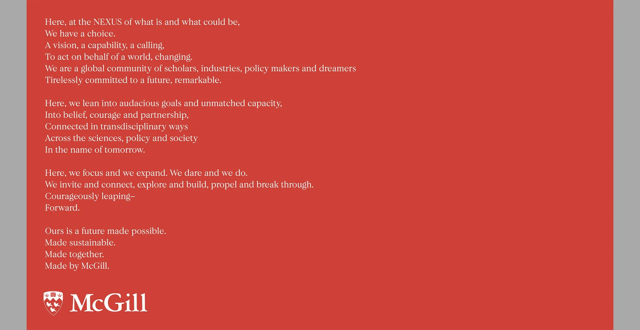
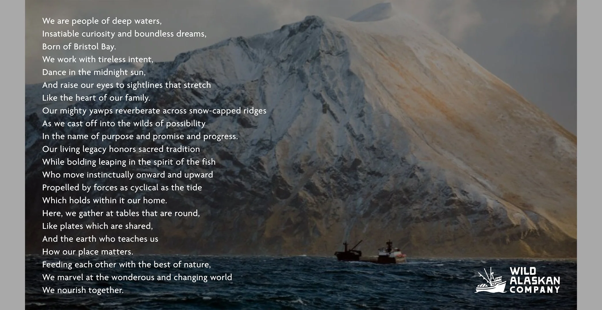
Brand Narratives
What:
Living at the intersection of strategy and expression, brand narratives are north stars. Core foundations. Translators. Touchstones. They guide and remind, clarify and inspire, invite in and lead forward. Because we always have, and always will, need stories to make sense of things.
Who:
McGill, Collectiveisme (2024)
Wild Alaska, Sid Lee (2020)
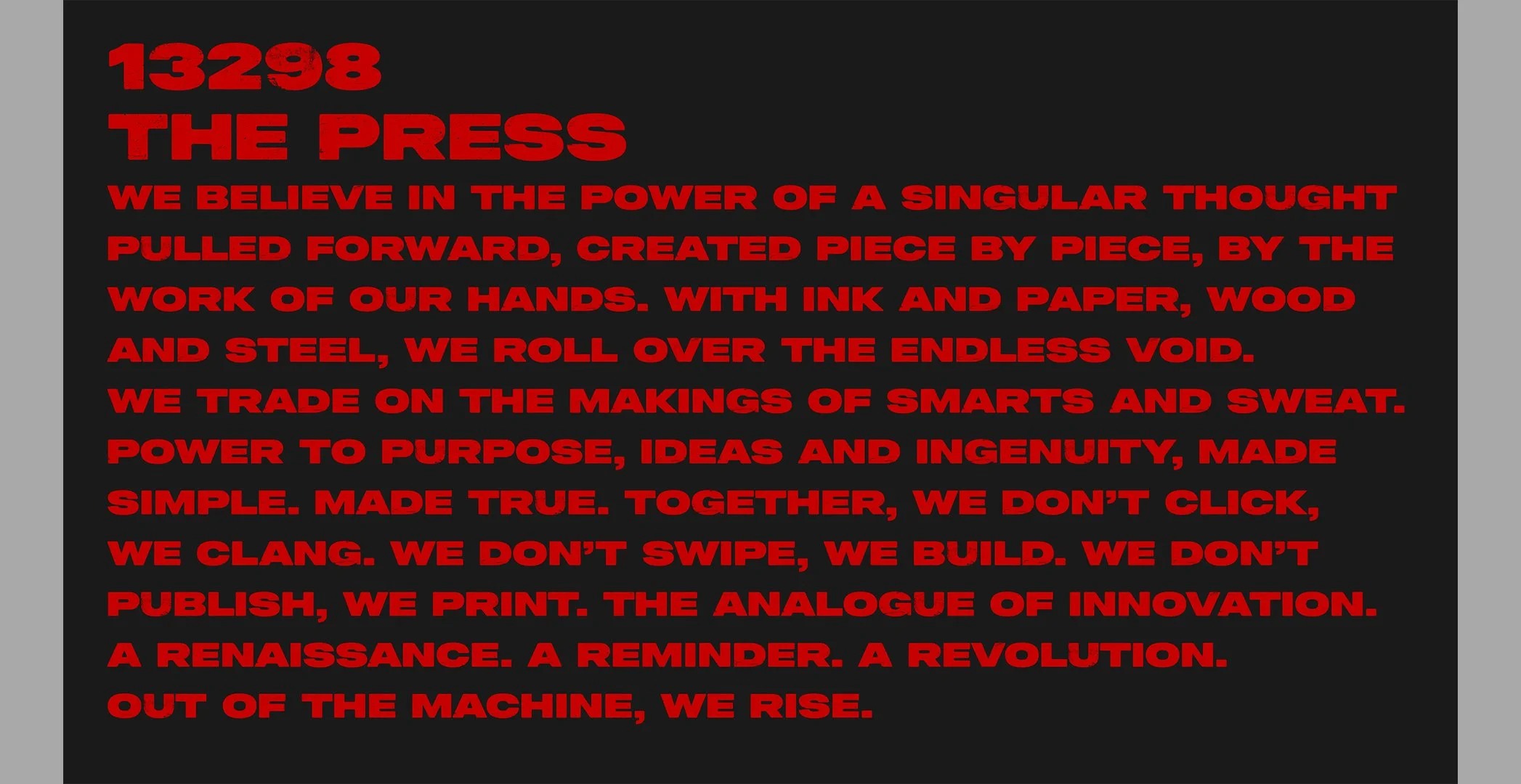
The Press, Hornall Anderson (2019)
Rough & Tumble Pub, 51 Eggs (2023)
Phinney Bischoff, Phinney Bischoff (2025)
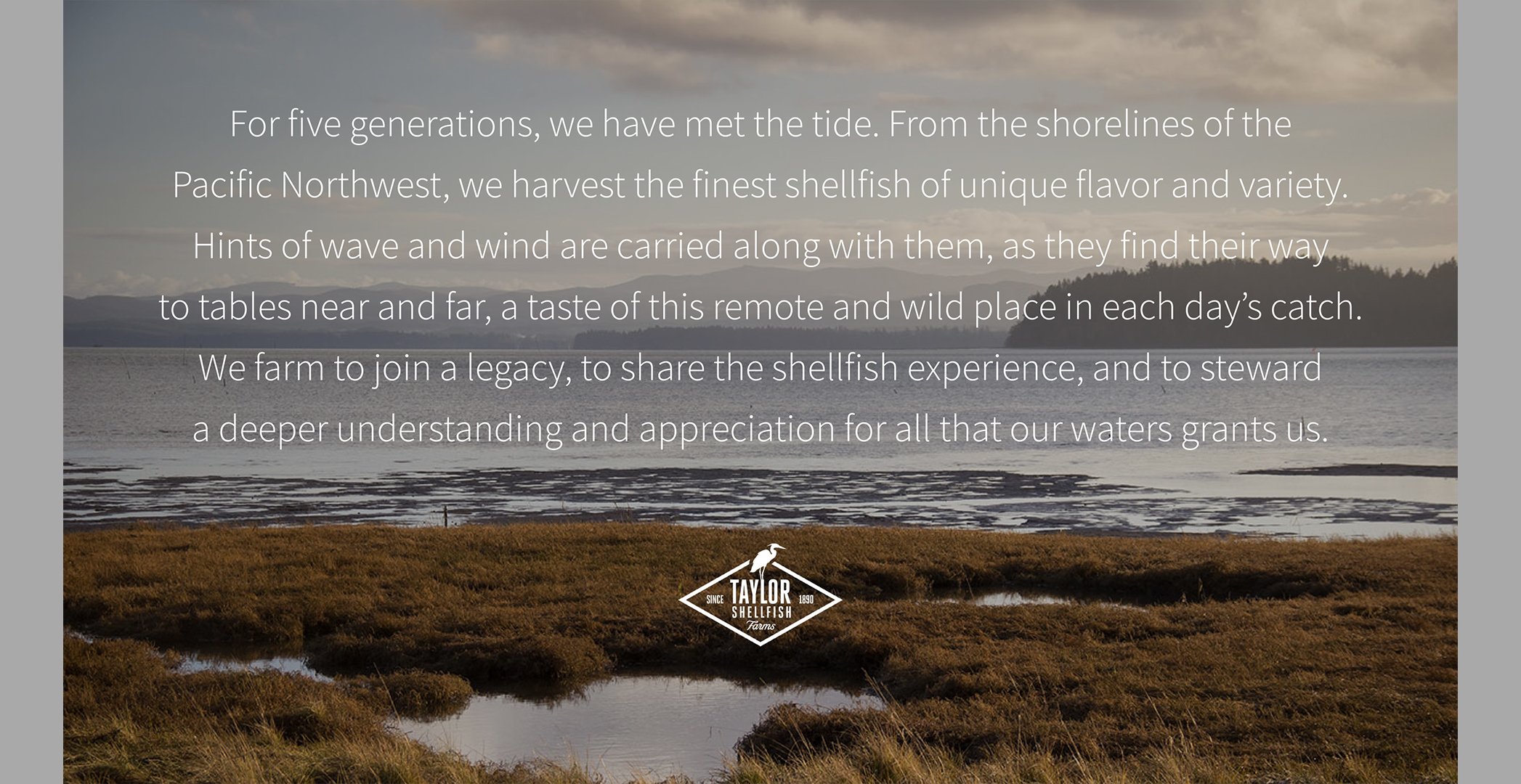
Taylor Shellfish, Hornall Anderson (2016)
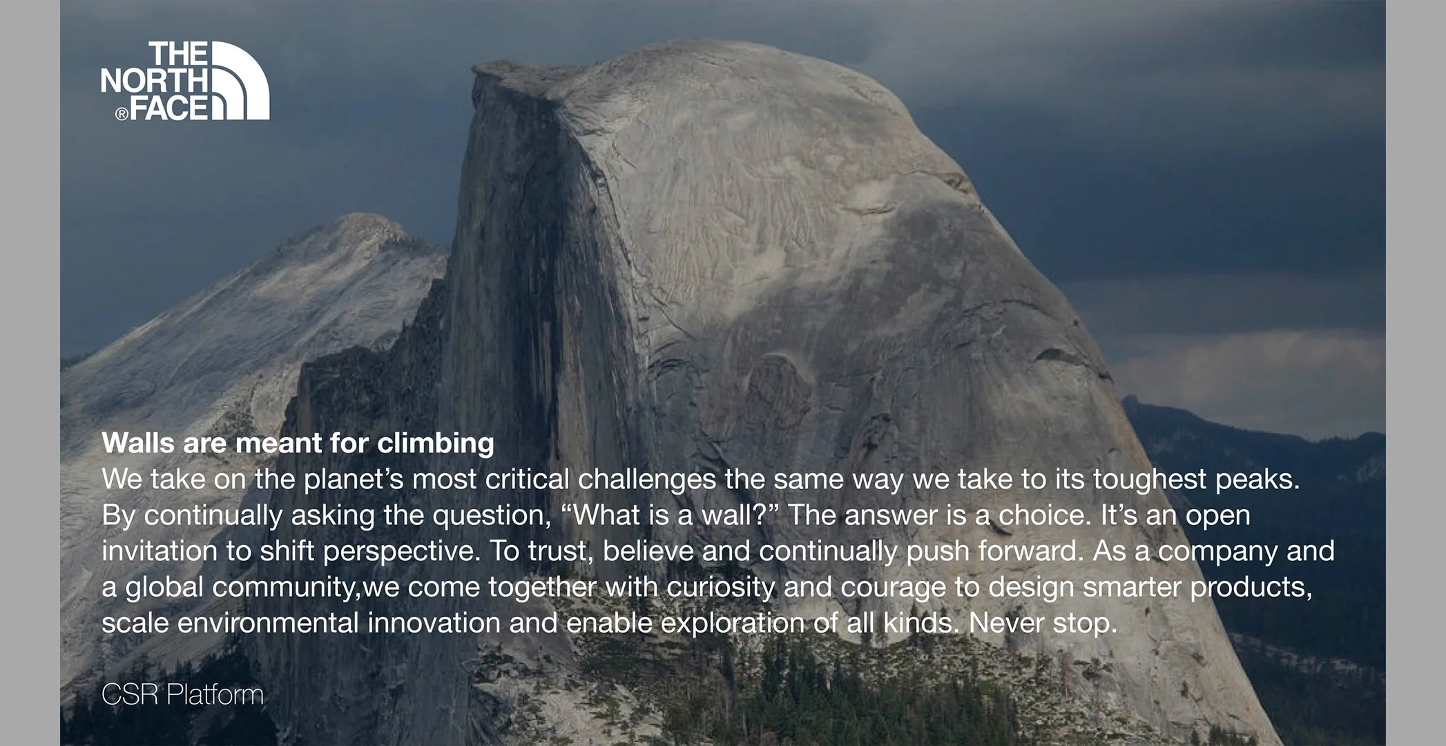
The North Face, Sid Lee (2020)
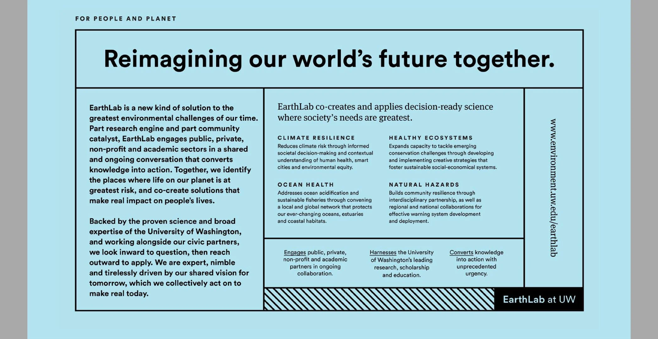
EarthLab at University of Washington, Hornall Anderson (2017)
Brand Identities
Who:
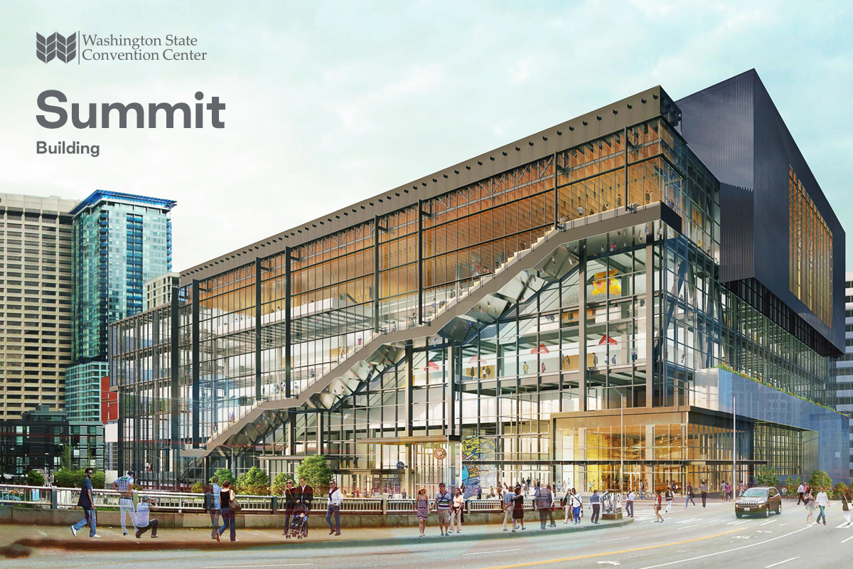
Washington State Convention Center, Hornall Anderson, Creative Director (2018)
Common + Critical, Common + Critical, Namer (2024)
Kin, Sid Lee, Creative Director (2021)
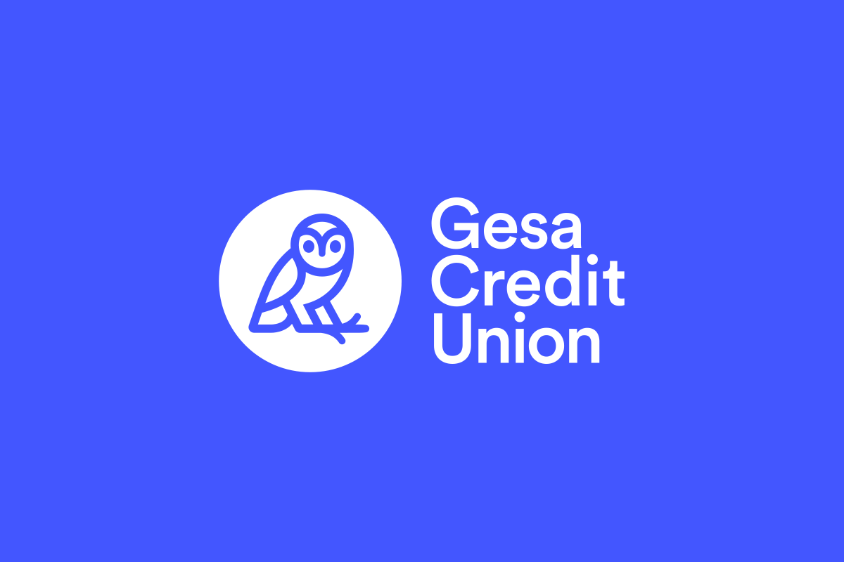
Gesa Credit Union, Sid Lee, Creative Director (2021)
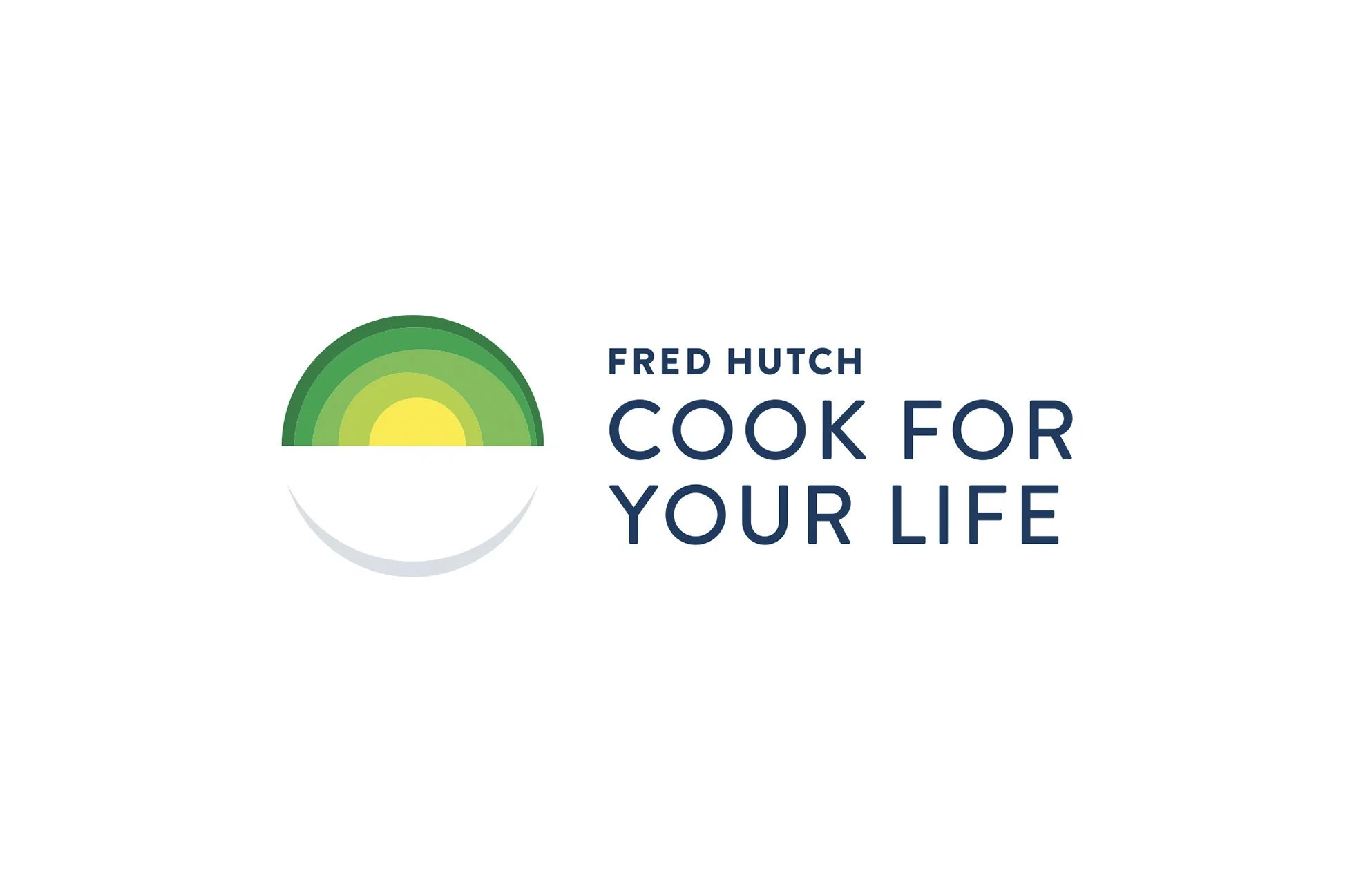
Fred Hutch Cook for Your Life, Sid Lee, Creative Director (2020)
98Point6, Hornall Anderson, Copy Director (2015)
Wellfound, Hornall Anderson, Creative Director (2017)
Centerline, Sid Lee, Creative Director (2019)
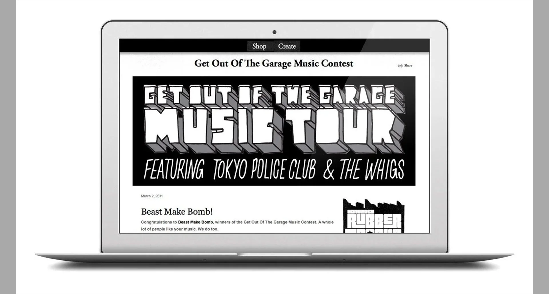
Get Out of the Garage, Converse, Namer (2008)
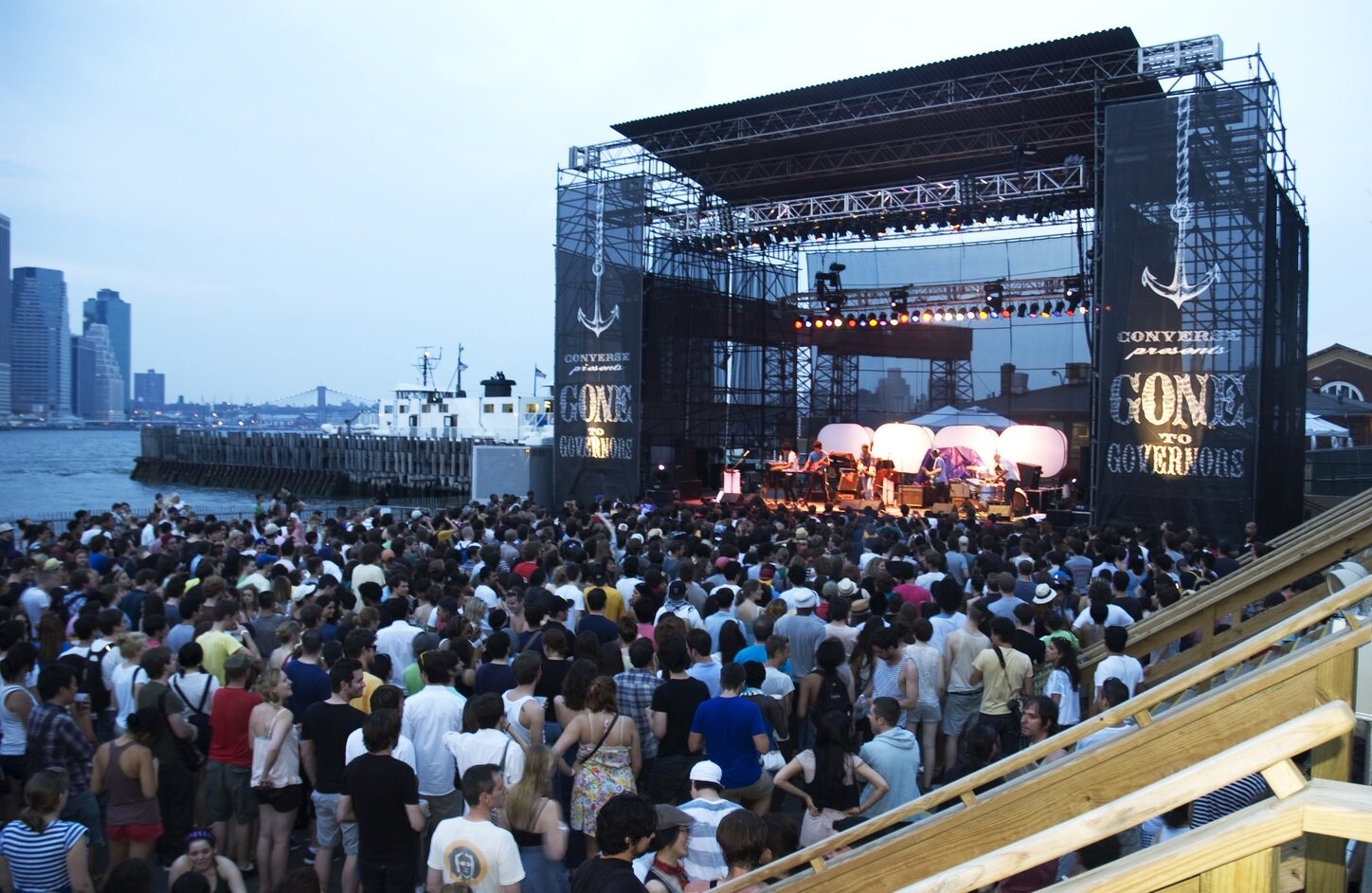
Gone to Governors, Converse, Namer (2010)
Continuum College at University of Washington, Creative Director (2016)
What:
A collection of visual and verbal identities for unique, regional and national entities, spanning industry, audience and lifecycle. Designed to be durable, accessible and memorable. For business and for people.

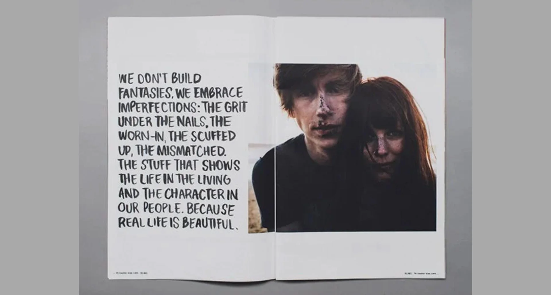
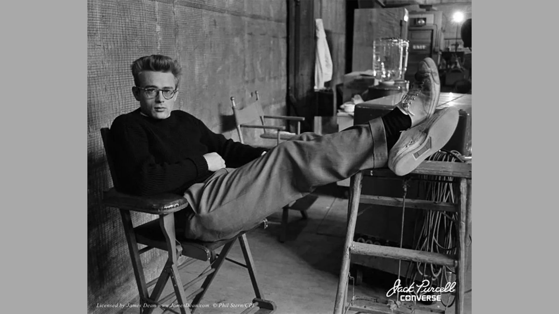
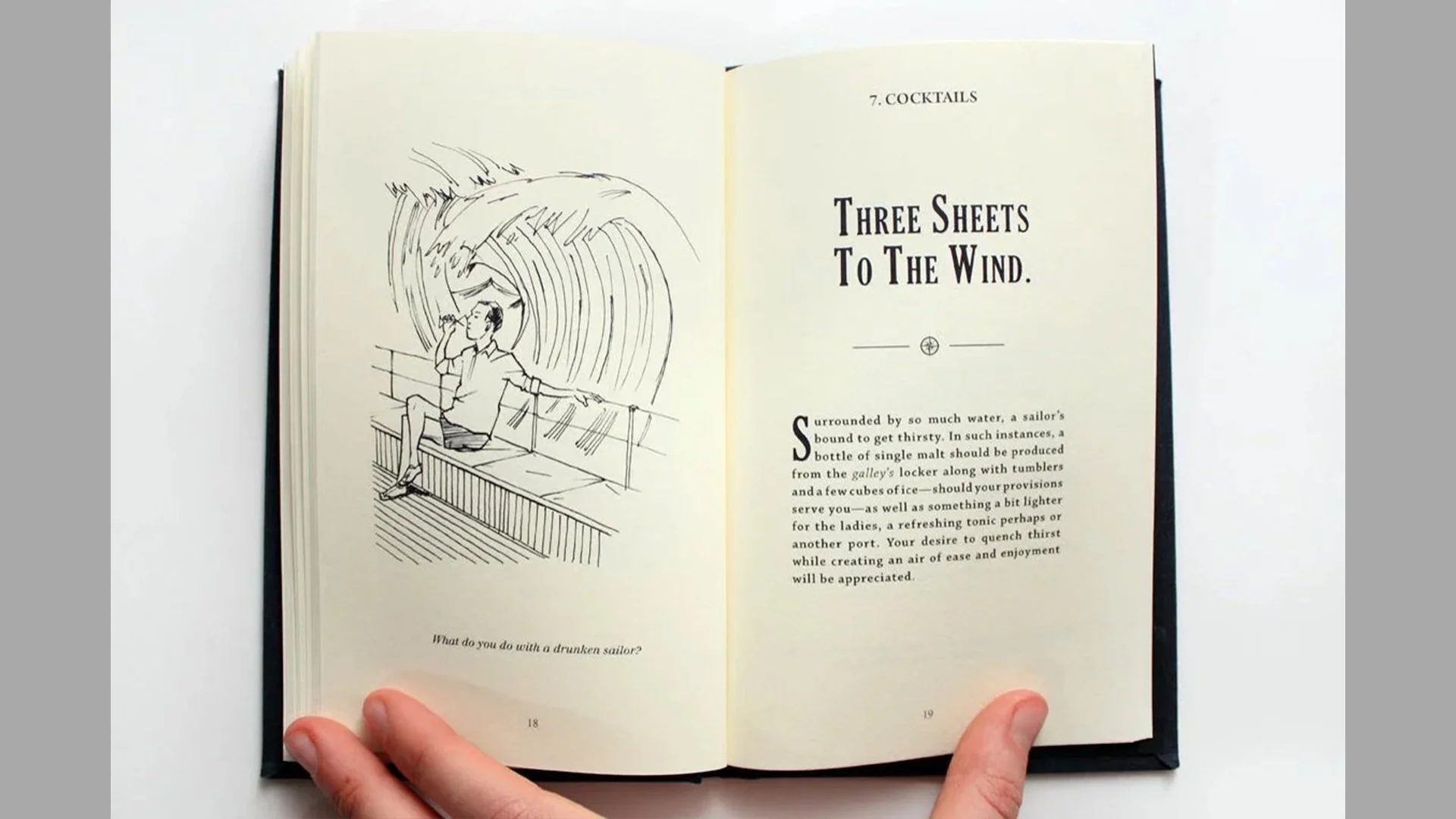
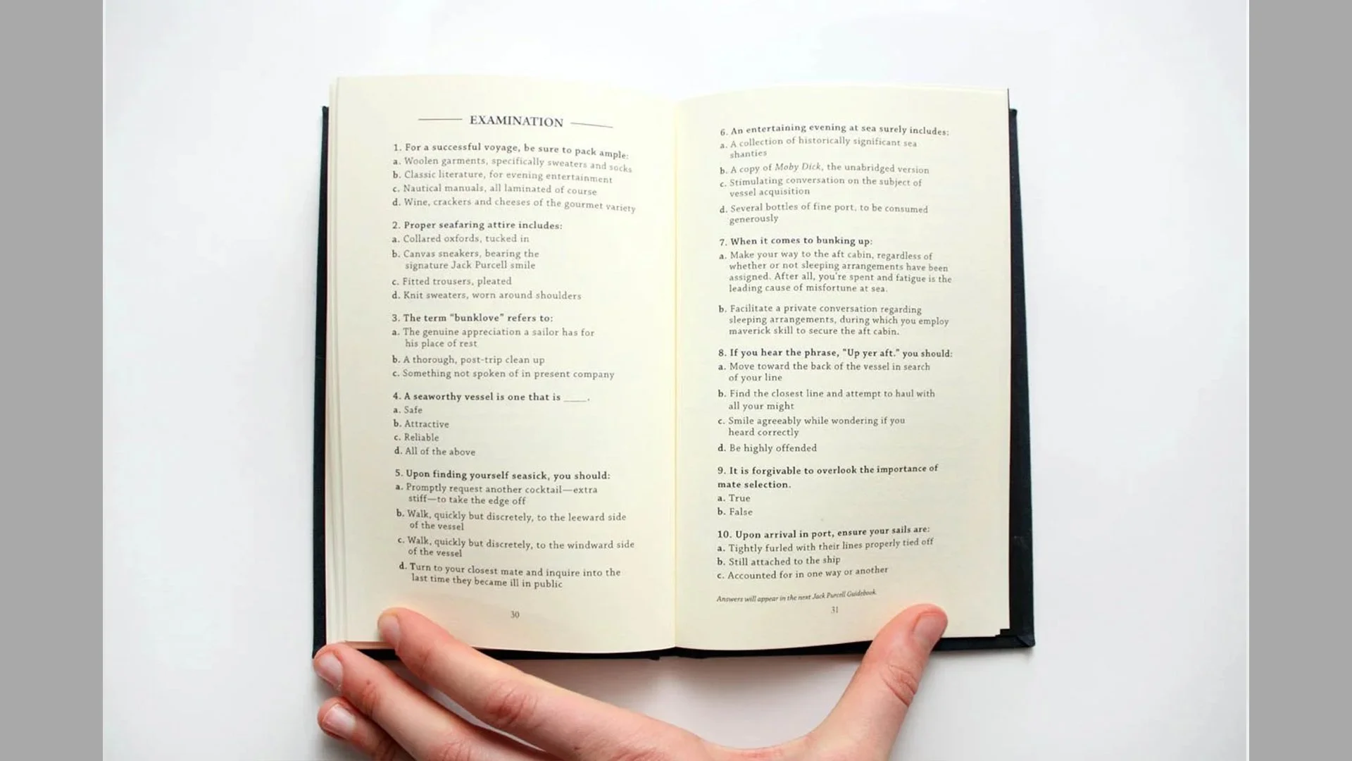
Jack Purcell
Why:
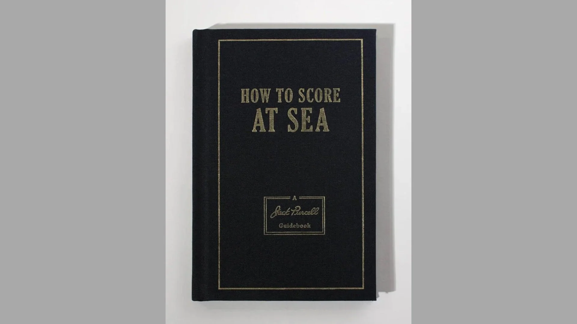
Jack Purcell is an icon among the clean cut. What’s lesser known is that Jack Purcell was a real person, a badminton legend who played with unconventional style. Keen and subversive, he was known to outsmart in order to outplay. As the Jack Purcell looked to expand its core offerings, it created a limited-edition nautical line and needed a seasonal story to match.
What:
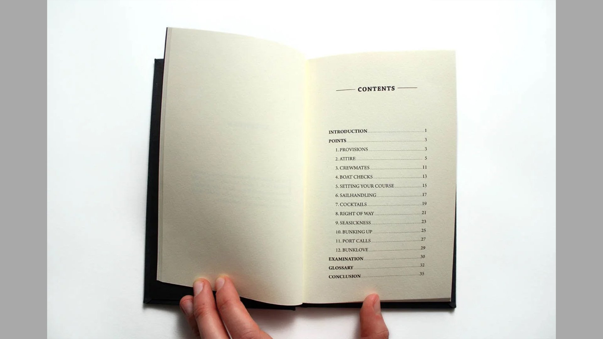
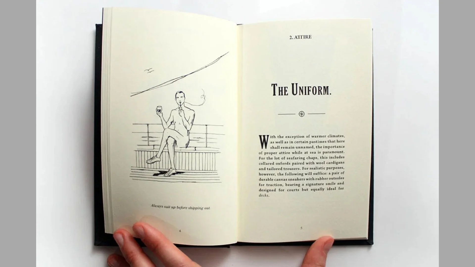
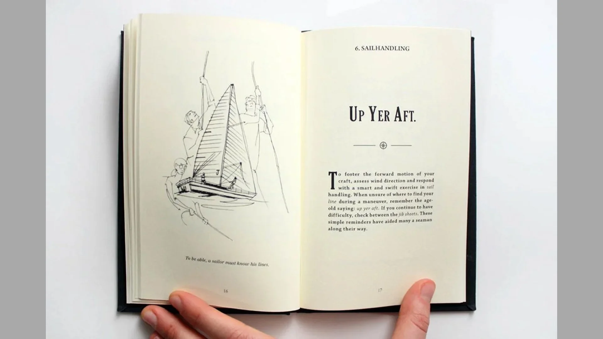
Foregoing the expected product sell sheets, we opted for a book. Clothbound, gold embossed and custom illustrated, it leveraged legitimate-but-questionable sailing language to share Jack Purcell’s imagined sea etiquette. Equal parts over the top, tongue in cheek and helpful, yes, but likely for only a select few. Just like the brand itself.
Who:
Converse Brand Design, Writer
Brand Voice, Seasonal Storytelling / 2009
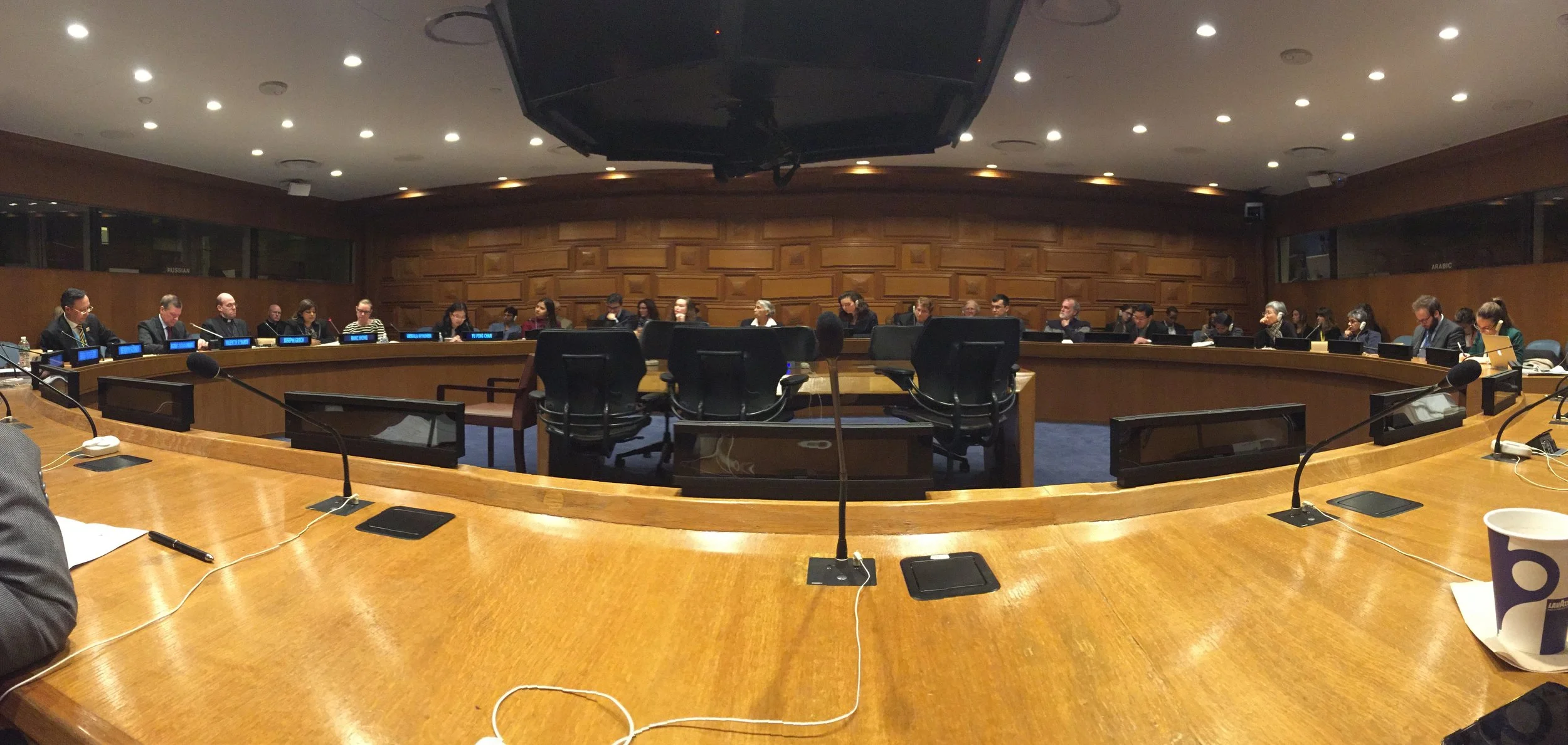
UN Speech
What:
In March of 2016, Rani partnered with Hornall Anderson in her fight to eradicate modern slavery by 2030. The first engagement asked to ghostwrite a keynote speech which was delivered at the Vatican, as part of the Global Sustainability Network March Forum. It spoke to the interconnection of all living things and our shared responsibility to act as a global community. It also called the world’s top business leaders to support the Modern Slavery Act and commit to fundamental changes in workplace standards.
The following month, Rani continued her support of the Corporate Freedom Initiative with a second ghostwritten speech which was delivered in a General Assembly session at the United Nations. In addition to positioning Rani as a survivor turned global advocate and change maker, “The Mark of Change” speech delved further into her foundation’s work on The Freedom Seal. This logo mark, planned to appear on slave-free consumer products, represents a new level of awareness on forced labor and the power of survivor-led solutions.
As of 2025, The Tronie Foundation has advised more than 150 countries on solutions for protecting children around the world.
Why:
50 million people. That’s more than New York City, Paris, Tokyo and Mumbai combined. It’s also how many slaves there were in the world, at the time of this work.
In 2016, the International Labor Organization estimated $150M in illegal profits for traffickers as a result of forced labor, while victims of forced labor lost at least $21B in unpaid wages and recruitment fees.
Rani Hong, President of the Tronie Foundation, has made it her life’s work to change that. A survivor of modern-day slavery, Rani was enslaved at the age of seven. Through unwavering determination and miraculous twists of fate, she has overcome horrific truths about our shared world, embodying the impact of our individual and collective choices. Today, as an activist, UN Ambassador and social entrepreneur, Rani brings vision and action to one of the greatest issues of our time.
Who:
Hornall Anderson, Creative Director / Writer
Brand Voice, Narrative & Ghostwriting / 2016
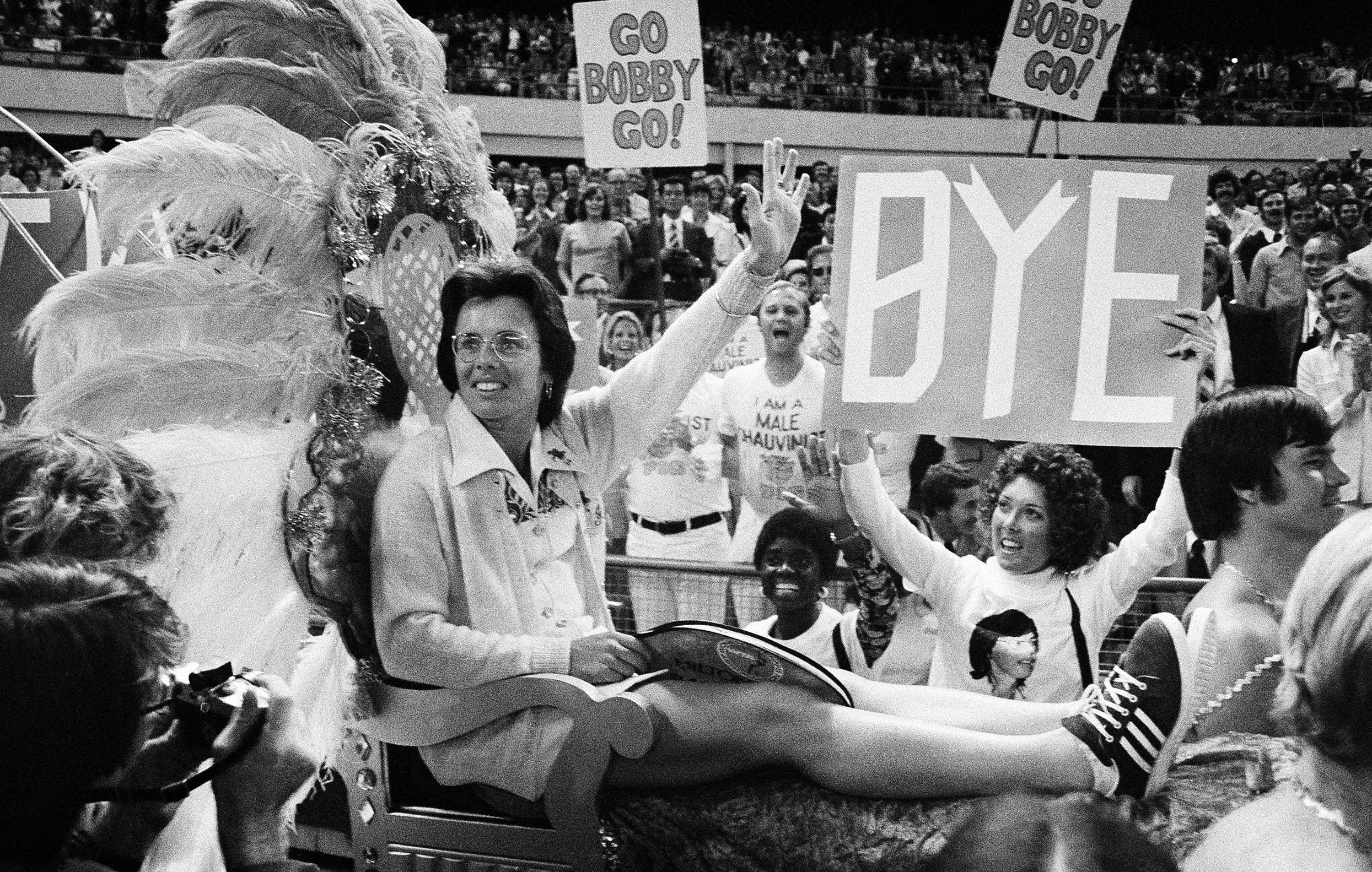
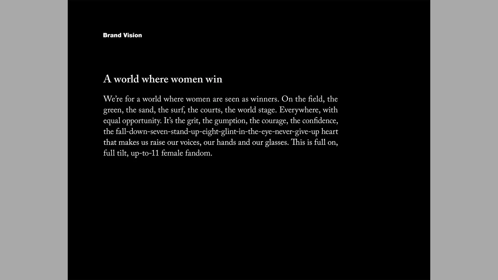
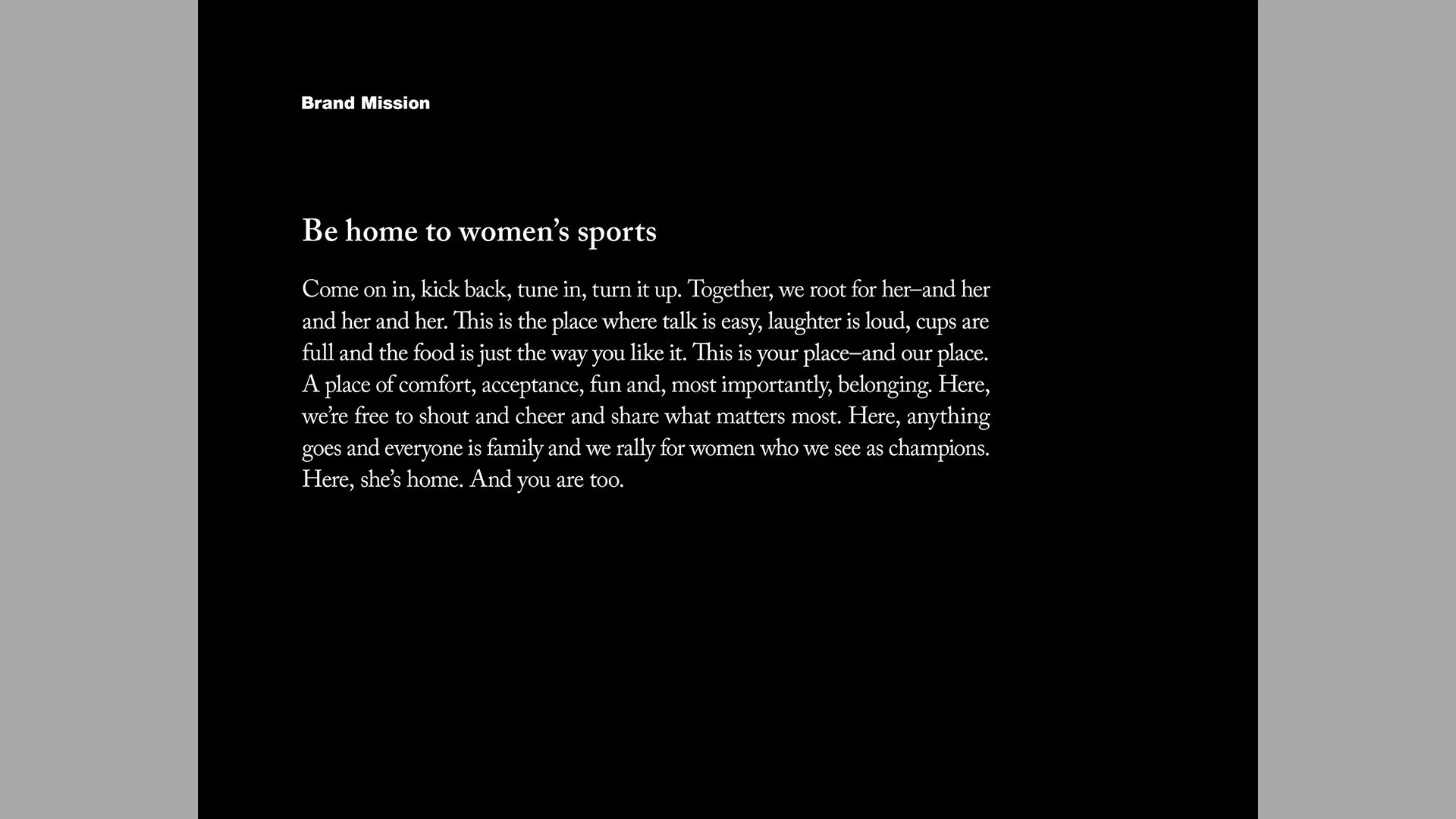
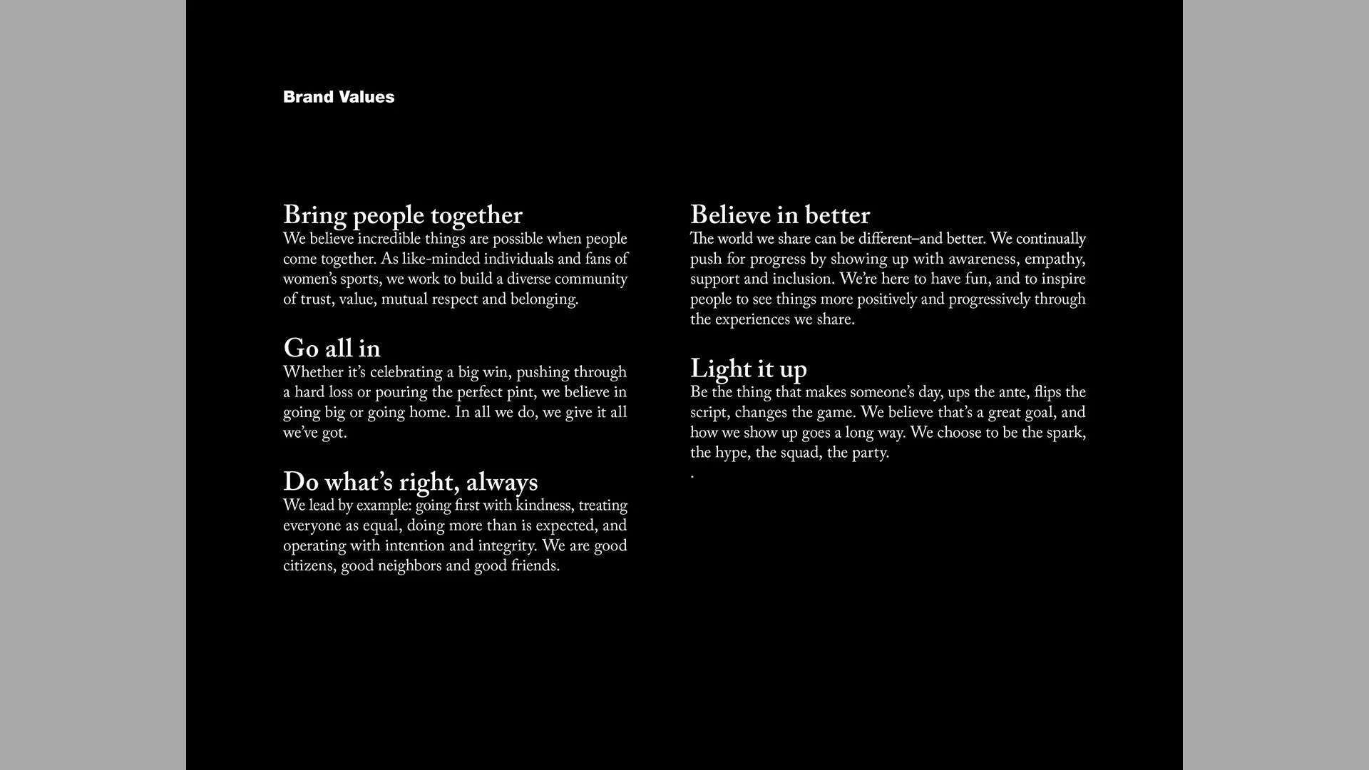
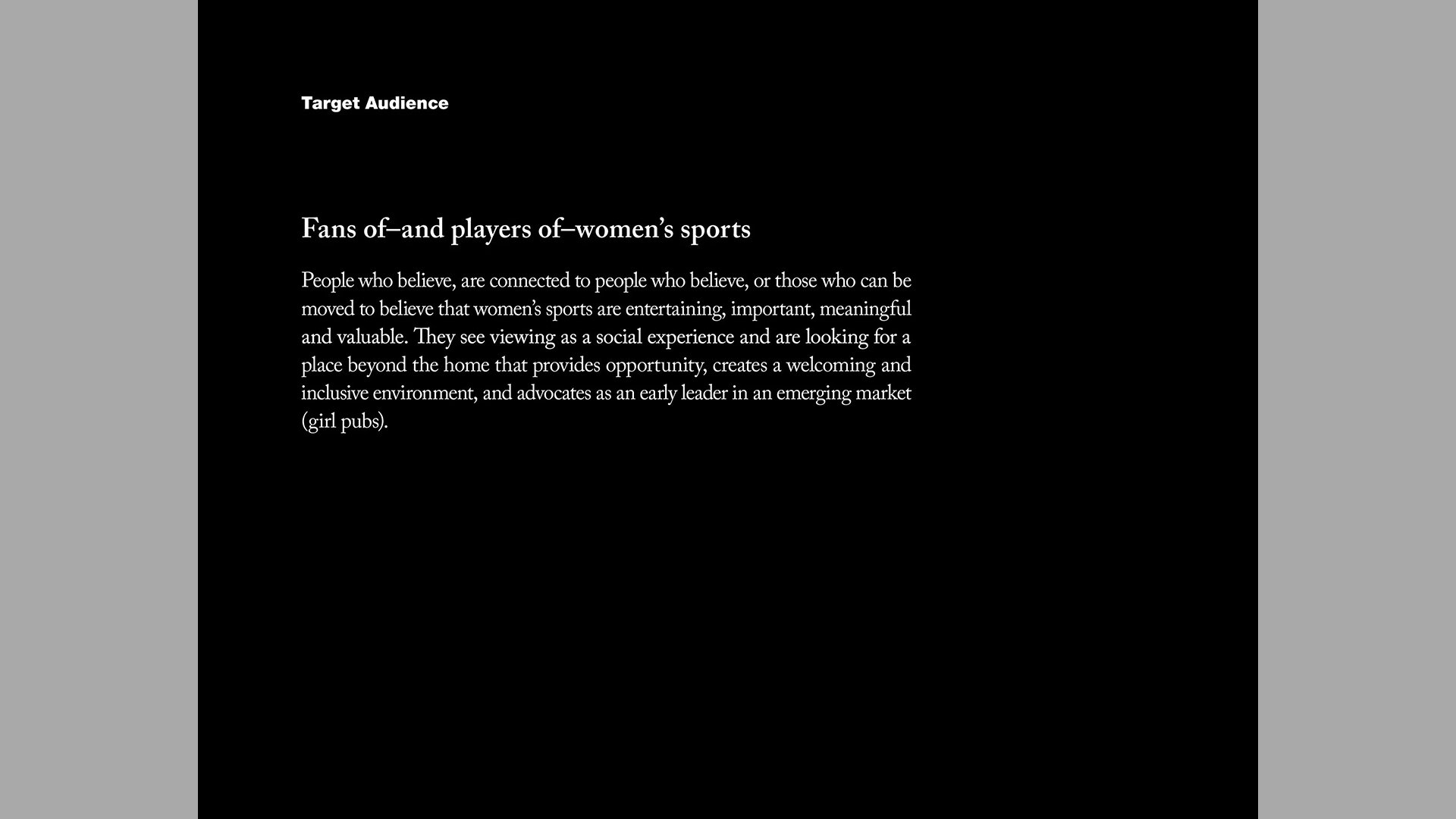
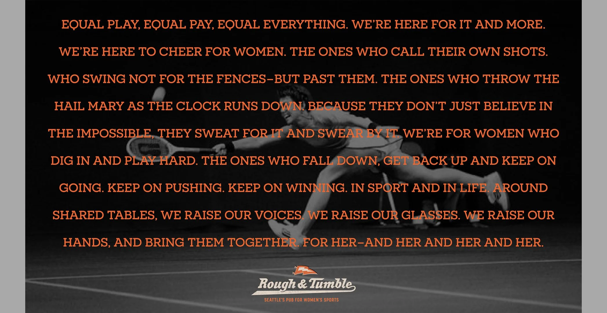
Why:
Women’s sports is the fastest growing sector of the sports industry, but finding women’s sports media coverage remains challenging. In an effort of vision, belief and opportunity, founder Jen Barnes wanted to ensure women athletes and their fans have an equitable, inclusive and inviting place–on the screen and at the table.
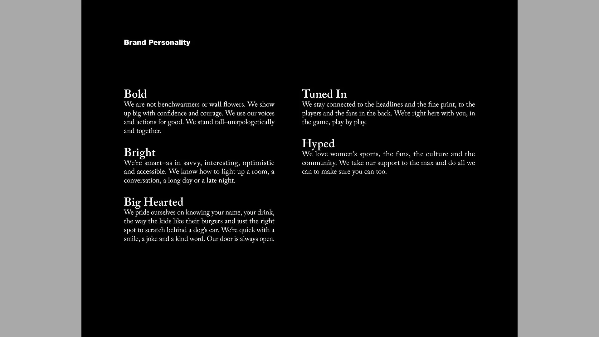
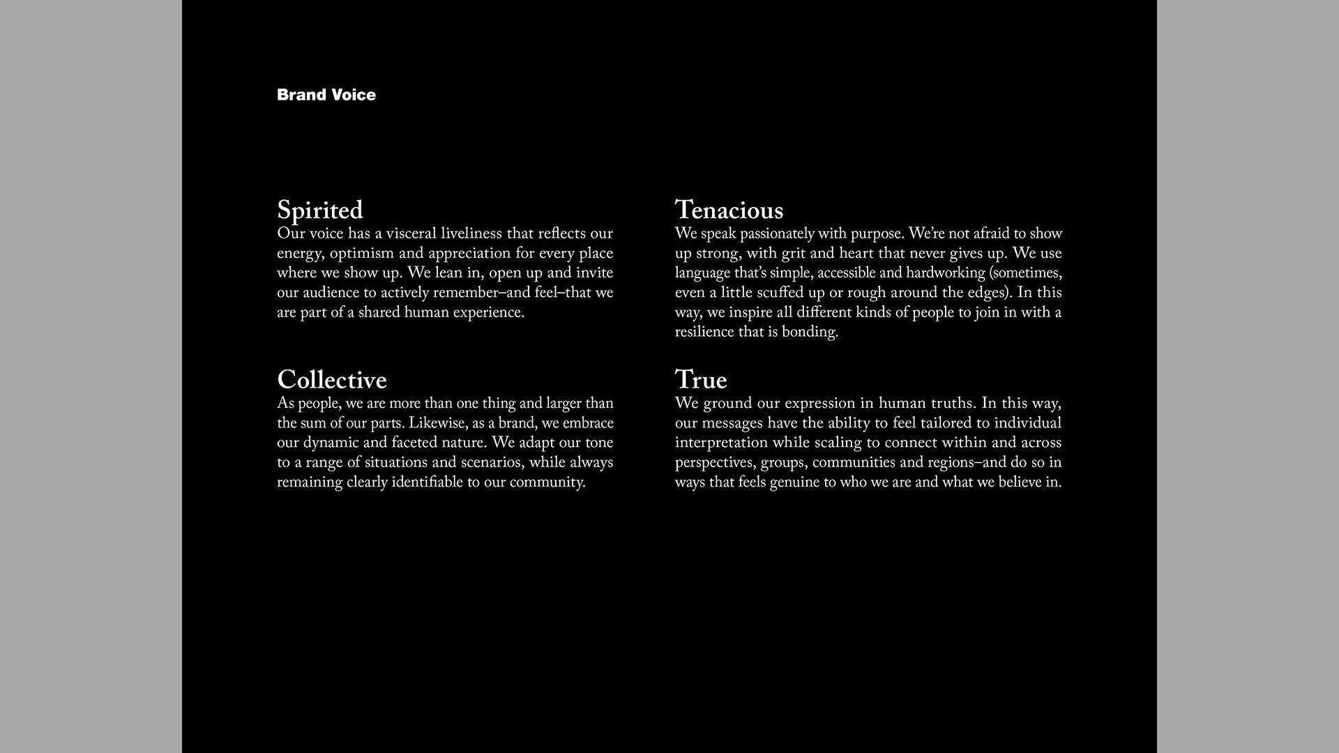
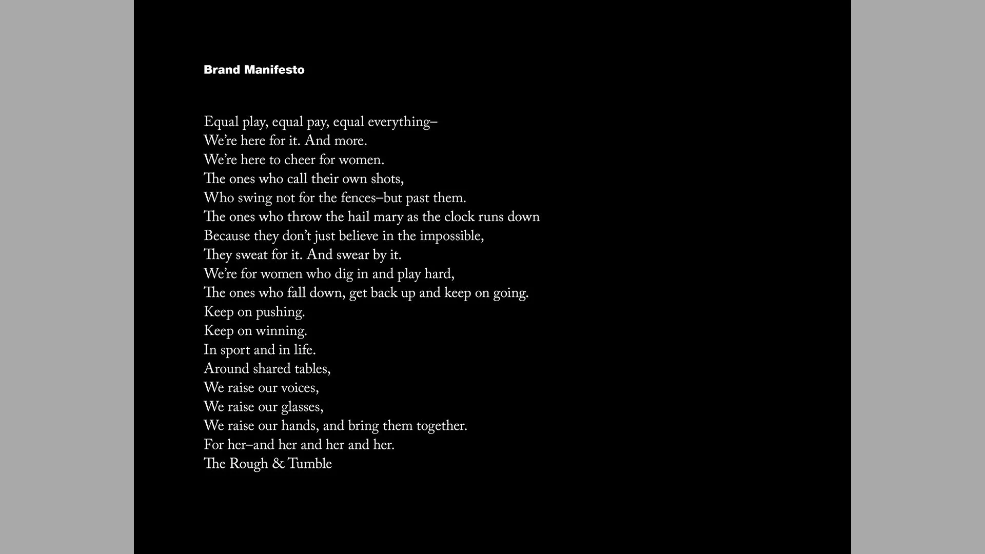
Rough & Tumble Pub
What:
Creating a home for women’s sports began with strategy, naming and a brand story for Seattle’s first (and the nation’s second) women’s sports pub. Rooted in historical significance and timeless relevance, Rough & Tumble is a badge of belonging for female fandom, a beacon for past and present athletes of all kinds, and a banner example of positive change, celebration and belonging.
Who:
51 Eggs, Strategist / Namer / Writer
Brand Strategy, Naming, Brand Voice & Narrative / 2023